Searching for the best Palm Springs color palettes for your home? You’re in the right place. From citrus brights to sun-faded pastels, warm neutrals to mid-century moodiness, this post has the whole spectrum. Plus: designer tips, common color crimes (mistakes you don’t wanna make), and exactly where to see these palettes in the wild, from iconic hotels to restaurants worth savoring.
Palm Springs isn’t subtle. And that’s exactly why we love it. Where else can you stare at a pink door, drink something neon by a turquoise pool, and somehow feel spiritually aligned? It’s not subtle, it’s not shy—and that’s why we keep coming back. It’s not just the architecture or the sunshine—it’s how the whole place makes you feel. Chic, but chill. Colorful, but not chaotic. Palm Springs is color therapy deep within the desert.
As a hotel designer, I pay attention to what makes a space memorable. It’s not just the layout or the finishes—it’s the color story. And Palm Springs has one of the best. These hues aren’t just photogenic. They’re functional. They bounce light, shape mood, and make a space feel considered without trying too hard. That’s what makes them so worth stealing. Especially at home, where we want our spaces to feel relaxed but elevated. Playful, but not loud. Styled, but still livable.
So, how did I come to fall in love with Palm Springs? Great question. Being a Chicago girl, trust me on this: January is the dreariest month of the year. Like, the peak of the bleak. Gloomy skies. Holiday hangovers. Inbox chaos. You’re halfway through Dry January and wondering if roasted carrots count as dinner. That’s the headspace I was in when I booked my winter birthday trip to Palm Springs with my sister and bestie. I needed an escape, something bright, a little absurd, and full of color.
We spent the week pool-hopping, vintage shopping, and brunching our way through the city. And somewhere between the pink stucco and the citrusy cocktails, I realized this place wasn’t just beautiful, it was smart. Every hue had a purpose. Every space had a feeling.
Because here’s the thing: Palm Springs isn’t just a look. It’s a palette philosophy. So whether you’re painting a guest room, designing a rental, or just looking to ditch the beige, I’ve got you. Let’s dive into the color stories, eras, and styling tricks that keep Palm Springs feeling fresh — decade after decade.
What Defines a Palm Springs Color Palette?
Here’s the thing about Palm Springs color: it has range. Some people love the soft, sun-faded pastels. Others go all in on bold contrasts and poolside kitsch. Whether you’re drawn to subtle desert tones or full technicolor flair, there’s room for your style in the mix.
Palm Springs interiors don’t follow one formula, but they do share a few signature traits:
- Warm desert neutrals inspired by sand, stone, and sun-bleached wood
- Soft pastels that feel faded by the sun, not plucked from a candy store
- Midcentury-era accent colors (teal, mustard, rust) used with restraint
- High contrast between light architecture and sculptural, grounded furnishings
These palettes aren’t just pretty, they’re practical. They reflect light, layer well with vintage or modern pieces, and create mood without overwhelming a room. Whether you’re color-curious or ready to make a statement, there’s a version that works for your style. And the next few sections will show you exactly how to find it.
Palm Springs Color Palettes
Palm Springs isn’t just one color — it’s a whole moodboard of possibilities. Some palettes lean crisp and citrusy, others go bold and glam. But the magic is in how they play with light, texture, and shape. These are the color stories that define the Palm Springs vibe — and translate beautifully into real homes (yes, even without a pool in sight).
Each palette you’ll see next captures a different slice of that world — some soft, some saturated, all unmistakably stylish.
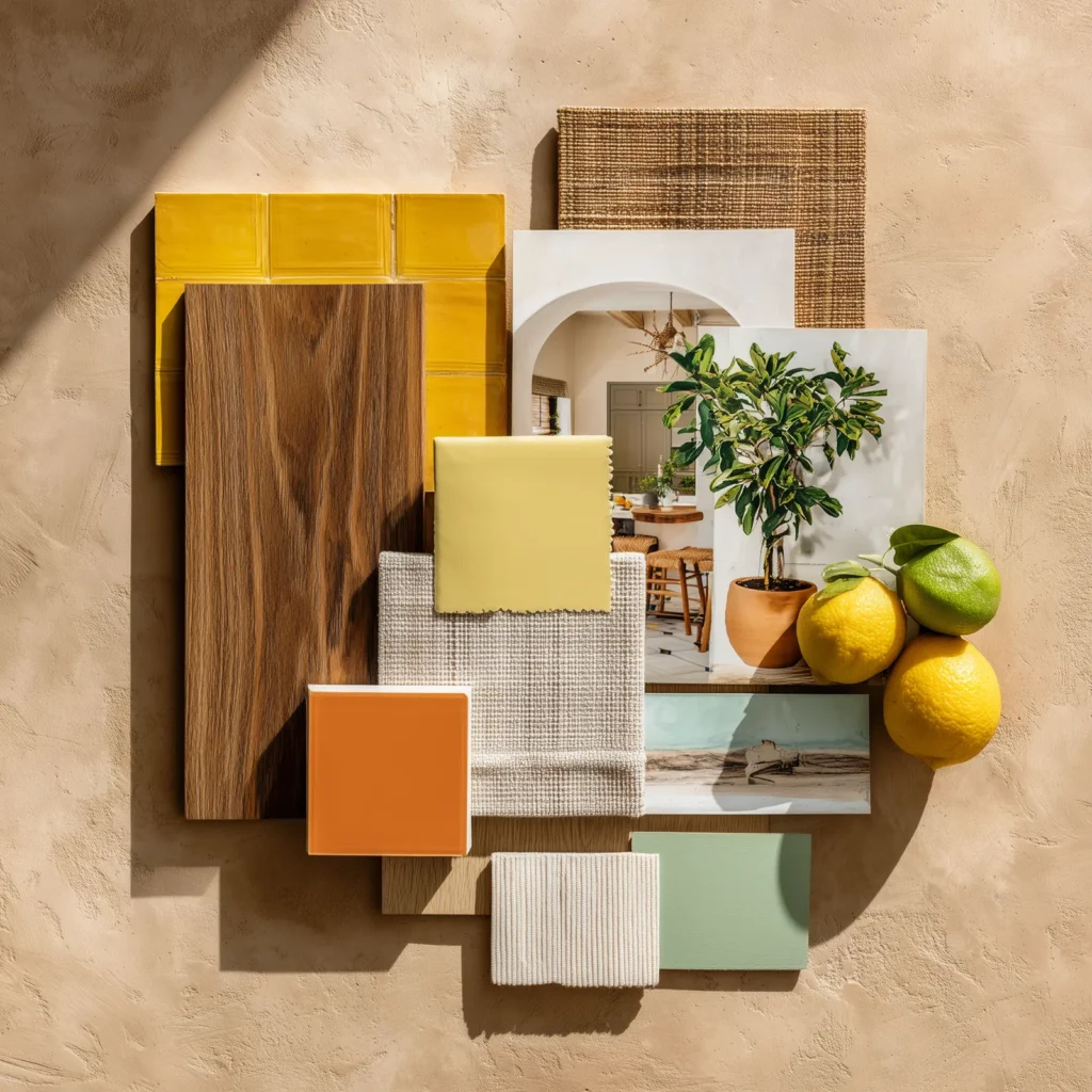
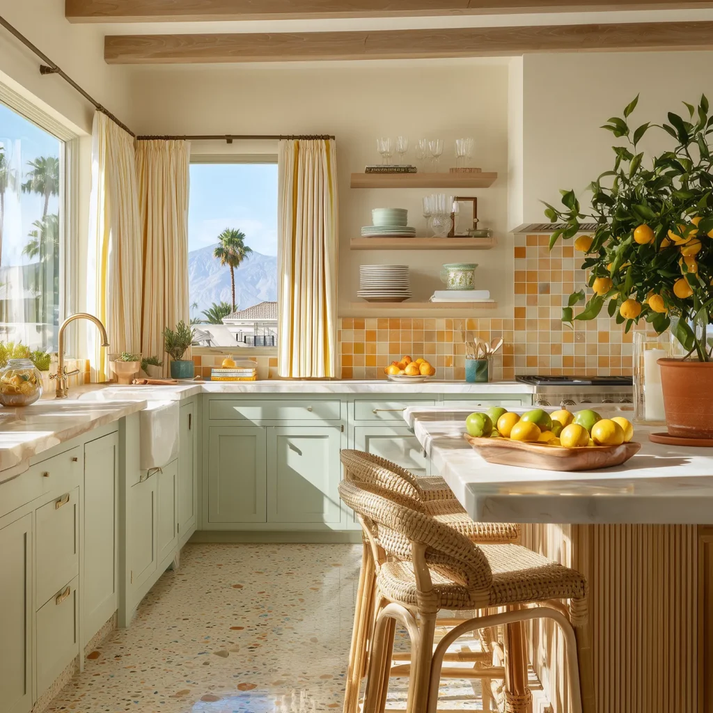
🍋 Citrus Bungalow
This palette is Palm Springs on a Sunday morning — bright, fresh, and slightly nostalgic. Think citrus fruits – lemony yellows, nectarines, creamy off-whites, soft tangerine, and leafy greens with just enough contrast to feel crisp.
Color Mood:
Cheerful, light, and endlessly livable.
Best for:
Kitchens, breakfast nooks, sunny bedrooms, or any space that needs a pick-me-up.
Style Pairings:
Mid-century furniture, white oak floors, ceramic tile, citrus trees in terra cotta pots.
Why it Works:
The warm tones feel cozy but not heavy, and the palette has enough clarity to look intentional without being loud. It’s a little Palm Springs bungalow, a little coastal Italy, and totally at home in modern interiors.
Designer Tip: Balance the brights with warm neutrals — sand, bone, and soft white — to keep things fresh but grounded.
Loving this Look: Definitely spend some time at the Parker Palm Springs Hotel. Book a night, or at a minimum grab the best brunch at Norma’s!
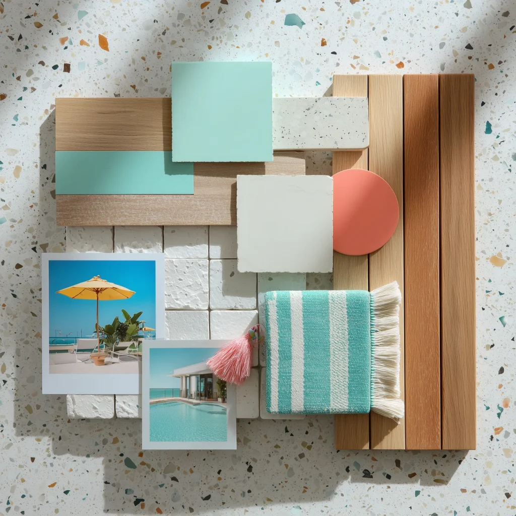
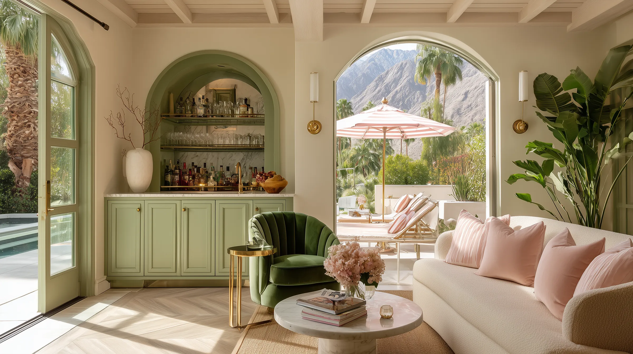
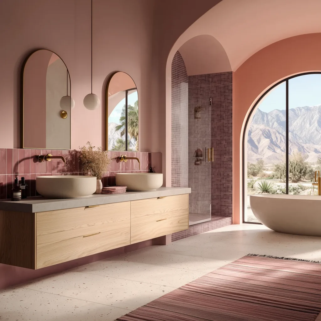
🍹 Poolside Spritz
If refreshing were a palette, this would be it. Poolside Spritz channels the playful side of Palm Springs — crisp aquas, retro mints, cool whites, and the occasional pop of coral or lemon. It’s bright, but clean. Think vintage loungers, striped umbrellas, and water that’s crystal clear.
Color Mood:
Cool, crisp, and vacation-coded.
Best for:
Bathrooms, breezy bedrooms, pool houses, or any space that needs a reset.
Style Pairings:
White tile, chrome fixtures, cabana stripes, breezeblocks, terrazzo.
Why It Works:
These hues naturally reflect light and create a clean, uplifting feel. Even in small or windowless spaces, they open things up and invite that spa-meets-swim-club energy in.
Designer Tip: Pair with clean lines and high-gloss or tiled surfaces to keep it feeling fresh—not sugary.
Love this Look? You’ll want to check out the full rainbow at the Saguaro Hotel (also a great place to grab a cocktail and swing in some hammocks).
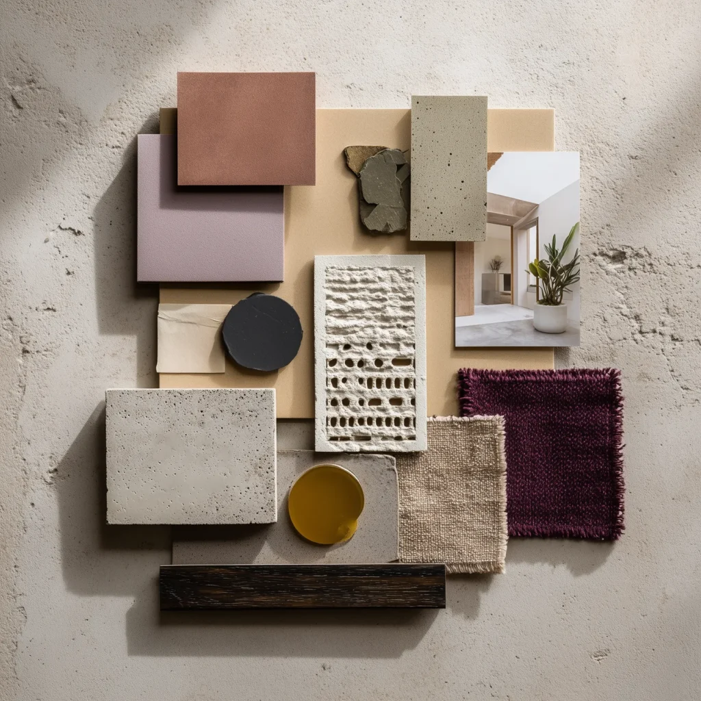
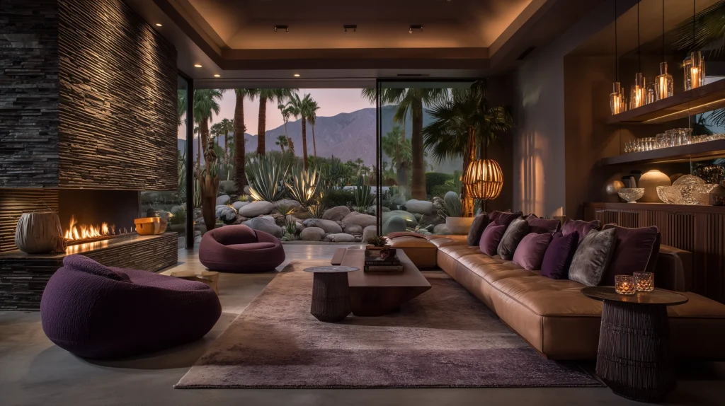
🪨 Mod Mirage
Mod Mirage is pure desert drama. Think long shadows, dark florals, and architectural edges softened by twilight. This palette leans deep and dusky—eggplant, aubergine, mauve, and charcoal—with hints of bronze or burnished gold that catch the light just enough. It’s the moodiest palette in the mix, and one of the most elegant.
Color Mood:
Saturated, smoky, and sculptural.
Best For:
Dining rooms, moody bedrooms, powder baths, or spaces that want a little edge.
Style Pairings:
Plaster walls, velvet upholstery, dark wood, bronze hardware, vintage lighting.
Why it Works:
These colors feel rich and restrained. The palette doesn’t shout—it smolders. It’s grounded, elevated, and surprisingly flexible when paired with soft neutrals or pale stone.
Designer Tip: Use matte or velvet finishes to let these tones absorb the light and deepen the mood. Avoid high-gloss—it breaks the spell.
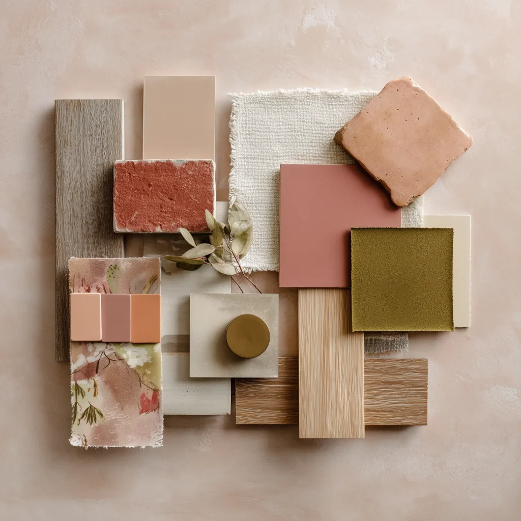
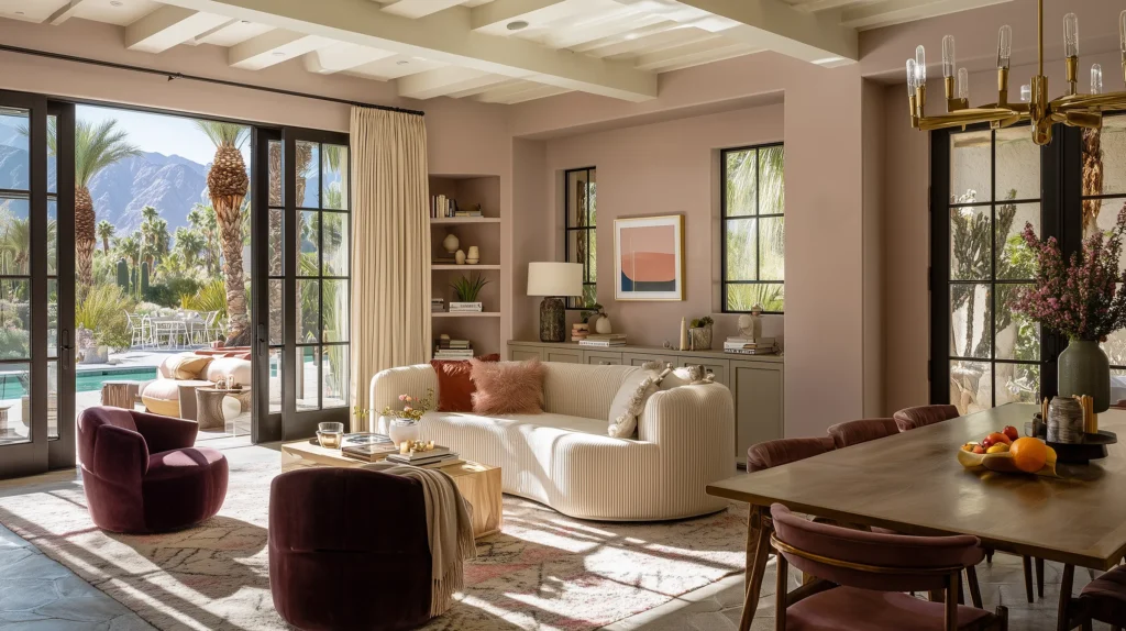
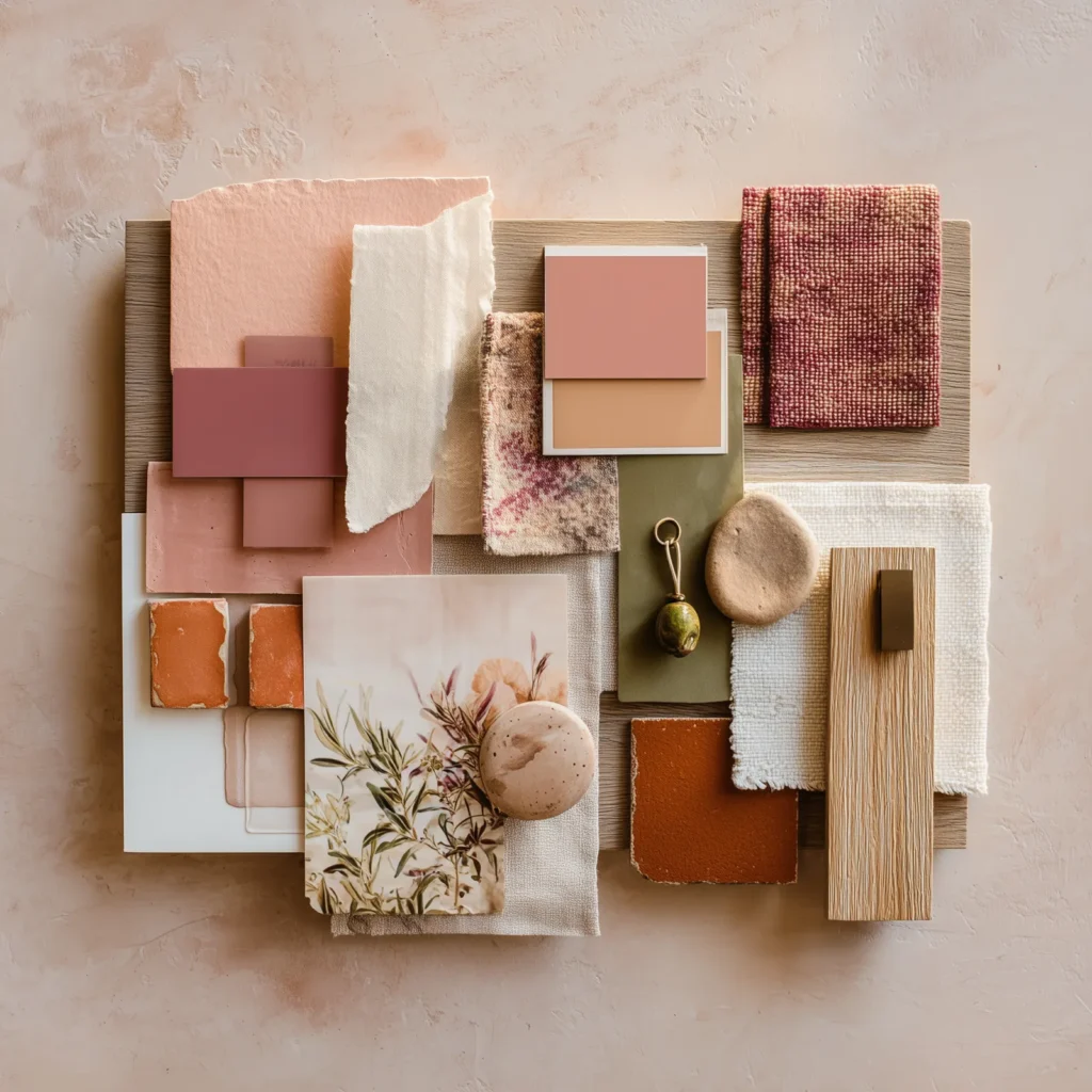
🌸 Cactus Bloom
Cactus Bloom is where Palm Springs gets soft and grounded. It blends sun-warmed desert tones with muted florals and lush greens—think terracotta, dusty rose, warm peach, and rich cactus or olive green. It’s romantic, but not fragile. A palette with roots, depth, and a soft glow that feels like desert flora at golden hour.
Color Mood:
Warm, natural, and slightly nostalgic.
Best For:
Bedrooms, cozy lounges, creative studios—spaces that need calm with character.
Style Pairings:
Linen and boucle, terracotta tile, olive velvet, woven pendants, vintage brass.
Why it Works:
The warm blush tones bring softness, while the deep greens ground the palette and give it contrast. Together, they create a space that feels styled, sunlit, and a little bit cinematic.
Designer Tip: Use the green as your anchor—on a sofa, cabinet, or drapery—and layer the lighter hues around it for a balanced, inviting room.
Love this Look? You’ll want to check out the Sands Hotel and especially the Pink Cabana restaurant!
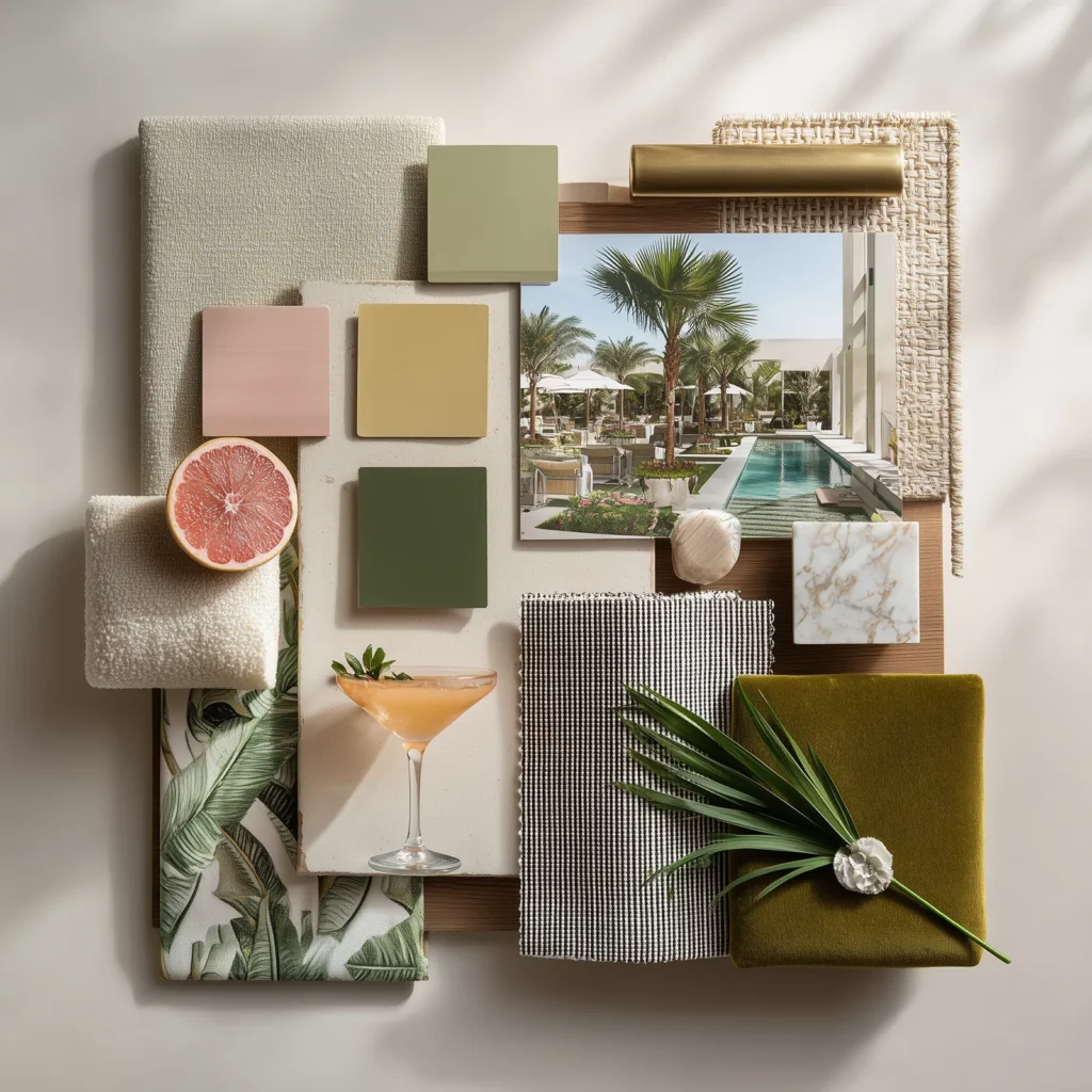
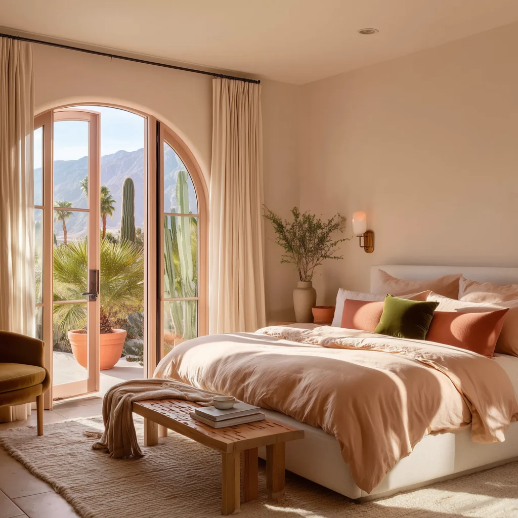
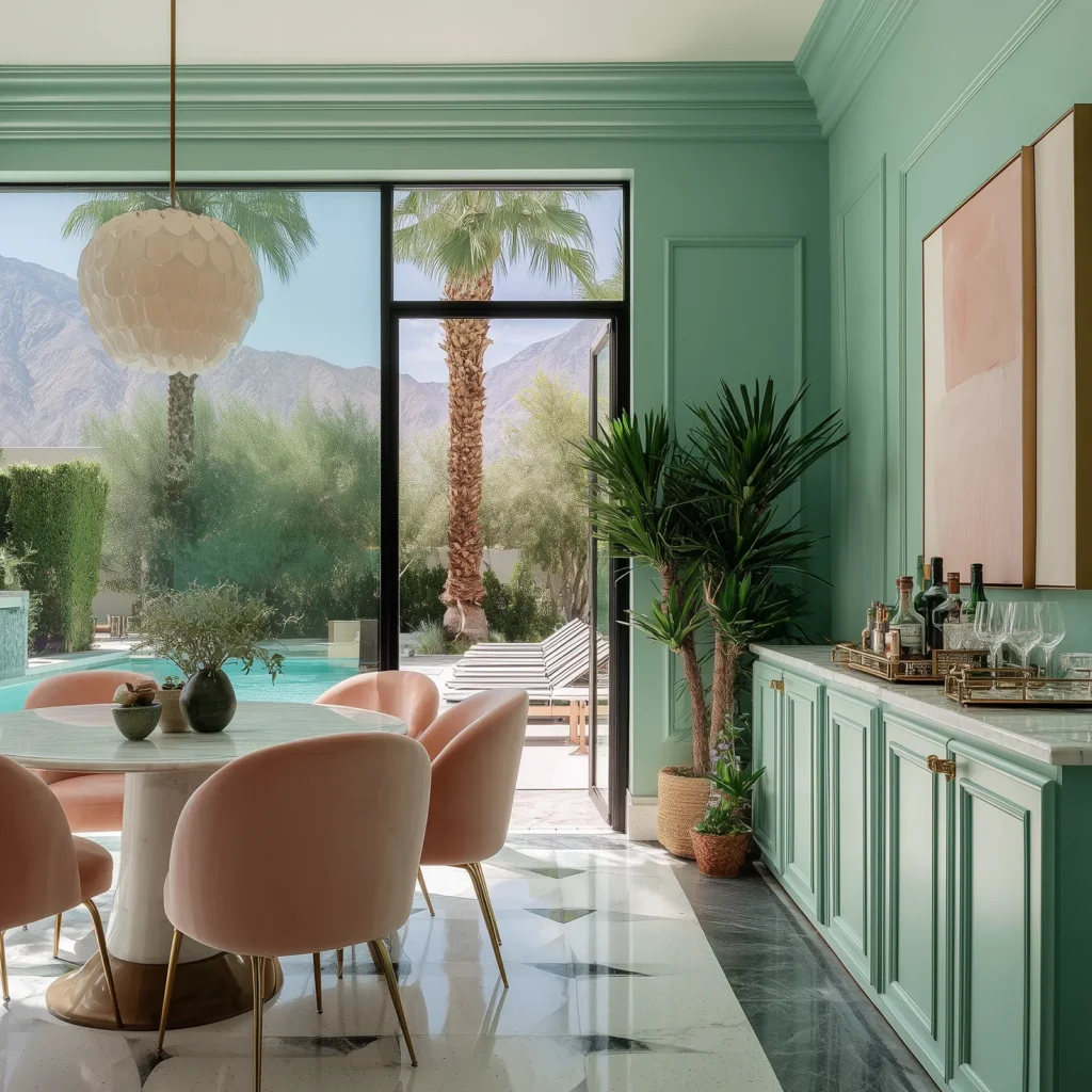
🌴 Palm Royale
Palm Royale channels the golden era of Palm Springs leisure — when racquet clubs were social centers, poolside cocktails were an afternoon ritual, and glamour came with structure. This palette captures that spirit with sun-washed blush, champagne, rich palm green, soft ivory, and deep charcoal; and it loves a bold pattern moment.
Color Mood:
Vintage resort drama with a crisp modern edge.
Best For:
Entryways, dining rooms, powder rooms, or anywhere that wants to feel styled and statement-ready.
Style Pairings:
Cabana stripes, scalloped edges, veined marble, velvet seating, rattan, tropical plants, and a well-placed checkerboar
Why It Works:
The palette has range — soft and sultry meets bold and tailored. Blush keeps it breezy, green grounds it, and pattern gives it punch. It’s nostalgic, but never theme-y. Just the right amount of drama in all the right places.
Designer Tip: Don’t hold back on contrast — this palette thrives when the lines are clear and the patterns are proud. If you’re going Palm Royale, go there.
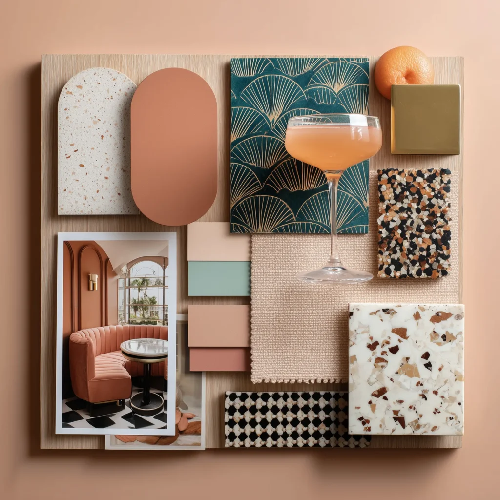
🌵 Desert Deco
Desert Deco is the glam side of Palm Springs — where soft desert tones meet bold geometry, and curves play nice with clean lines. The palette mixes adobe pink, soft clay, warm sand, peachy neutrals, and crisp accents like teal, jet black, or polished brass. It’s all about sculptural silhouettes, mirrored finishes, and a little dramatic flair.
Color Mood:
Warm, elegant, and architecturally playful.
Best For:
Powder rooms, dressing areas, bar lounges, or any space that wants to feel both styled and fun.
Style Pairings:
Scalloped edges, checkerboard floors, archways, lacquered cabinetry, mixed metals (brass, rose gold, matte black), and rich materials like velvet and marble.
Why It Works:
The palette stays warm and sun-kissed, but the finishes elevate it. It leans glamorous without feeling stuffy — perfect for spaces that want personality and polish. It’s equal parts Palm Springs bungalow and art deco daydream.
Designer Tip: Lean into symmetry, statement lighting, and bold contrast. This palette loves a moment — so give it one.
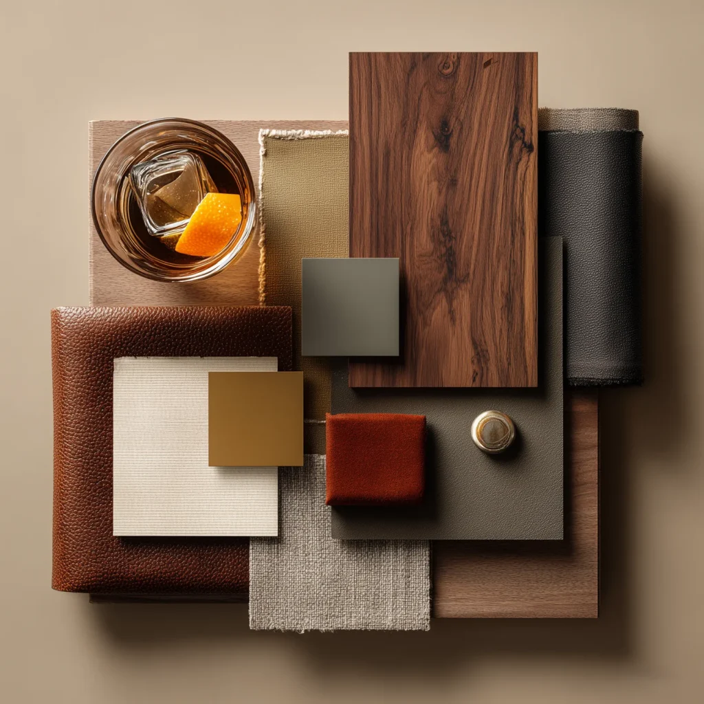
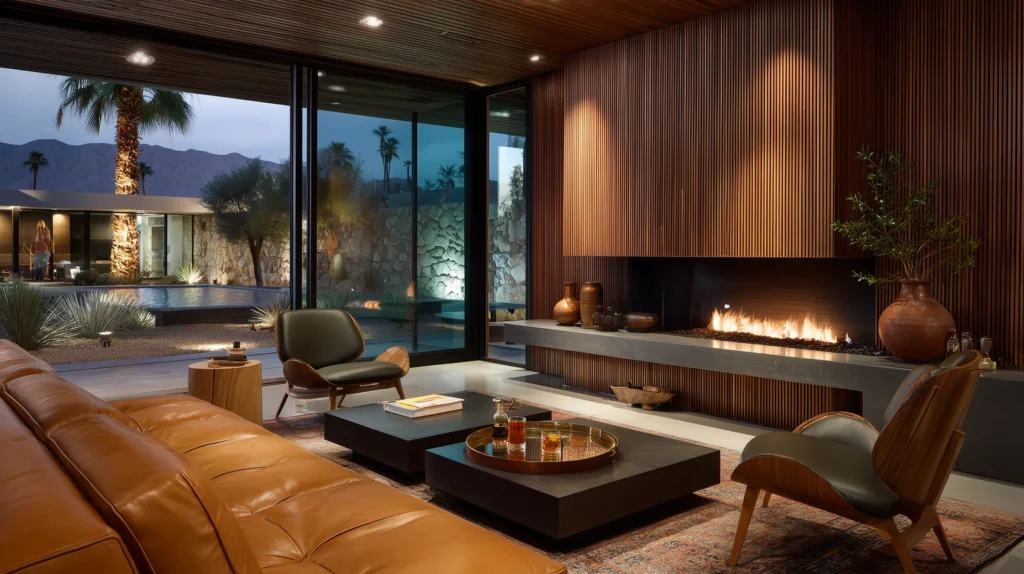
🕰 Walnut Hour
Walnut Hour is the whiskey-soaked alternative to the pastel spritz. It’s the deeper, moodier side of Palm Springs — where mid-century style meets desert ease. Picture a walnut bar cart, olive velvet, rust leather, golden light slanting across travertine floors. The palette mixes rich wood tones with olive green, ochre, creamy neutrals, and the occasional pop of mustard or black.
Color Mood:
Warm, tailored, and quietly confident.
Best For:
Living rooms, dens, moody lounges, or anywhere you want to feel grounded (with good taste and great lighting).
Style Pairings:
Walnut millwork, travertine, boucle, bronze hardware, smoked glass, vintage barware.
Why It Works:
It’s rooted in material and mood. The colors don’t fight for attention — they create atmosphere. Everything feels intentional, but relaxed. It’s the palette you pour into at the end of the day.
Designer Tip: Let the wood lead. Then add one rich tone — olive, rust, or mustard — to push it toward modern. And never underestimate the power of dim lighting and a great cocktail glass.
How to Use Palm Springs Color Without Going Full Flamingo
Let’s be real: it’s easy to love Palm Springs color, and just as easy to get it wrong. Yes, this palette has range, but too much of anything (even pink) can go sideways fast.
It’s not just about using color, it’s about knowing how much and where to use it. The best spaces balance boldness with breathability. They know when to let a pink moment shine and when to let the walls step back.
So if you’re wondering how to get the look without feeling like you’re living inside a tiki bar, here’s your cheat sheet:
Do This:
- Balance bold color with warm neutrals. Sand, camel, ivory, and walnut give bright hues space to land.
- Use one saturated color at a time. Let it lead, then support it with restraint.
- Try monochromatic palettes. Different shades of the same color can be unexpectedly rich and refined.
- Highlight architecture. Use color to frame features, not just fill space.
- Layer texture instead of adding more color. Think boucle, tile, rattan, plaster, and stone.
Don’t Do This:
- Don’t stack brights without grounding them. You need a neutral to hold it all together.
- Don’t default to gray or bright white. They kill the warmth of these palettes.
- Don’t confuse color with clutter. Editing is everything.
- Don’t ignore proportion. A color on a cabinet is a whisper; on four walls, it’s a shout.
- Don’t pile on too many motifs. Flamingos + palm leaves + neon signs? Pick one. Or else it’s a circus.
- Don’t forget the vibe. Ask what the room should feel like, not just what you want it to look like.
Common Palm Springs Color Mistakes (and How to Dodge Them)
It’s easy to love Palm Springs color. It’s harder to use it well. Here are a few common missteps I’ve seen and exactly how to avoid them so your space feels styled, not scattered.
- No edit. Just because you love five colors doesn’t mean they all belong in one room.
- Ignoring lighting. A color that sings in the desert may fall flat under LED bulbs. Always test swatches in your actual space.
- Matching everything. Coordination isn’t the goal — contrast and layering are.
- Over-pastel-ing your room into a baby shower.
- Stacking five brights with no neutral. It’s a palette, not a party store.
- Overstyling with resort clichés. One flamingo is cute. Five is a crisis.
- Using cool gray as your base. It flattens everything. Go warm or go home.
- Too much of a good thing. Bold colors are strongest when surrounded by calm. Use restraint.
Palm Springs Color Palette Questions (You Should Be Asking)
What is a Palm Springs color palette?
It’s not one set of colors, it’s a range of moods. You can go soft and sun-faded, bold and saturated, or warm and grounded. What ties them together is how they behave in a space: they respond to natural light, they hold shape without shouting, and they create a sense of place. Whether you’re into blush and mint, rust and olive, or sand and cream, there’s a Palm Springs palette that meets you there.
Where can I see these Palm Springs color palettes in real life?
Honestly? Just walk outside in Palm Springs, the entire town feels like a curated color story. But if you want the true palette pilgrimage, start here:
- The Parker Palm Springs Hotel: warm woods, bold wallpaper, and color with swagger.
- The Saguaro Hotel: it’s a rainbow. On purpose.
- The Pink Cabana: mint green meets Palm Springs glam. Come for the color, stay for the cocktails.
Want more photogenic doors, iconic hotels, and must-see design stops? I mapped it all out for you in my Aesthetic Travel Guide to Palm Springs. Pack sunglasses. You’ll need them. 🌴🦩☀️😎
Do Palm Springs color palettes work outside the desert?
Absolutely. You don’t need palm trees or a mid-century roofline to make these colors sing. The secret isn’t the ZIP code, it’s how you use them. Palm Springs palettes work because they’re warm, joyful, and grounded in good design logic. Even if you’re staring out at snowbanks or suburbia, these hues can bring in the mood you’re craving — energy, calm, character. No pool? No palm trees? No problem. You can still nail the vibe, just don’t overdo the flamingos. 🦩
What if I don’t know what colors to use in my house?
You’re not alone. Most people get stuck here. Choosing a color palette can feel like a personality test no one gave you the answers to, especially if you like more than one vibe. That’s why I love starting with Palm Springs-inspired palettes: they give you range. Want soft and sunny? Go blush and sand. Feeling bold? Try olive, rust, and walnut. You’re not locked into pastels or poolside kitsch. You get to choose your mood.
Still stuck? Start with one color you love like a chair, a tile, or a vintage print, and build a palette around it using warm neutrals, contrast, and restraint. Color doesn’t have to be loud. It just has to work.
P.S. If you’re more into cozy and earthy, I’ve got a post on Modern Cottagecore palettes that might be more your speed. Less spritz, more herbal tea.
What colors are most common in Palm Springs interiors?
The classics: dusty pink, mint green, lemon yellow, rust, olive, warm white, and rich wood tones. But that doesn’t mean you use them all together. The point isn’t to recreate a rainbow; it’s to find your lane. Some spaces lean fresh and citrusy, others feel moody and architectural. Choose a palette that matches your home’s light and your personal style, not someone else’s photo.
What’s the difference between Palm Springs and Miami color palettes?
Palm Springs color is filtered through the desert. Think soft light, warm neutrals, dusty tones. Miami color hits louder: slicker, glossier, cooler in tone. Think of it like this: Palm Springs has an architectural backbone. Miami has a nightlife glow. One isn’t better than the oteher, but if you’re going for calm, edited, and design-forward? Palm Springs is the vibe.
What Palm Springs colors work best with mid-century furniture?
Mid-century pieces love colors that feel warm, grounded, and a little unexpected. Think olive, rust, ochre, mustard, walnut, warm white — or even a dramatic aubergine or teal in the right space. But the real trick? Don’t match everything. Let the furniture lead, and choose colors that bring contrast or calm, not competition.
How do I make Palm Springs colors feel modern, not retro?
It’s less about avoiding “retro” and more about making the palette yours. Palm Springs color has history, yes, but it doesn’t have to be nostalgic. Pair vintage hues with sculptural lighting, clean millwork, or unexpected materials like plaster, matte tile, or metal. Keep the styling sharp. Let the color story stand on its own, not compete with a room that’s gone all-in on nostalgia.
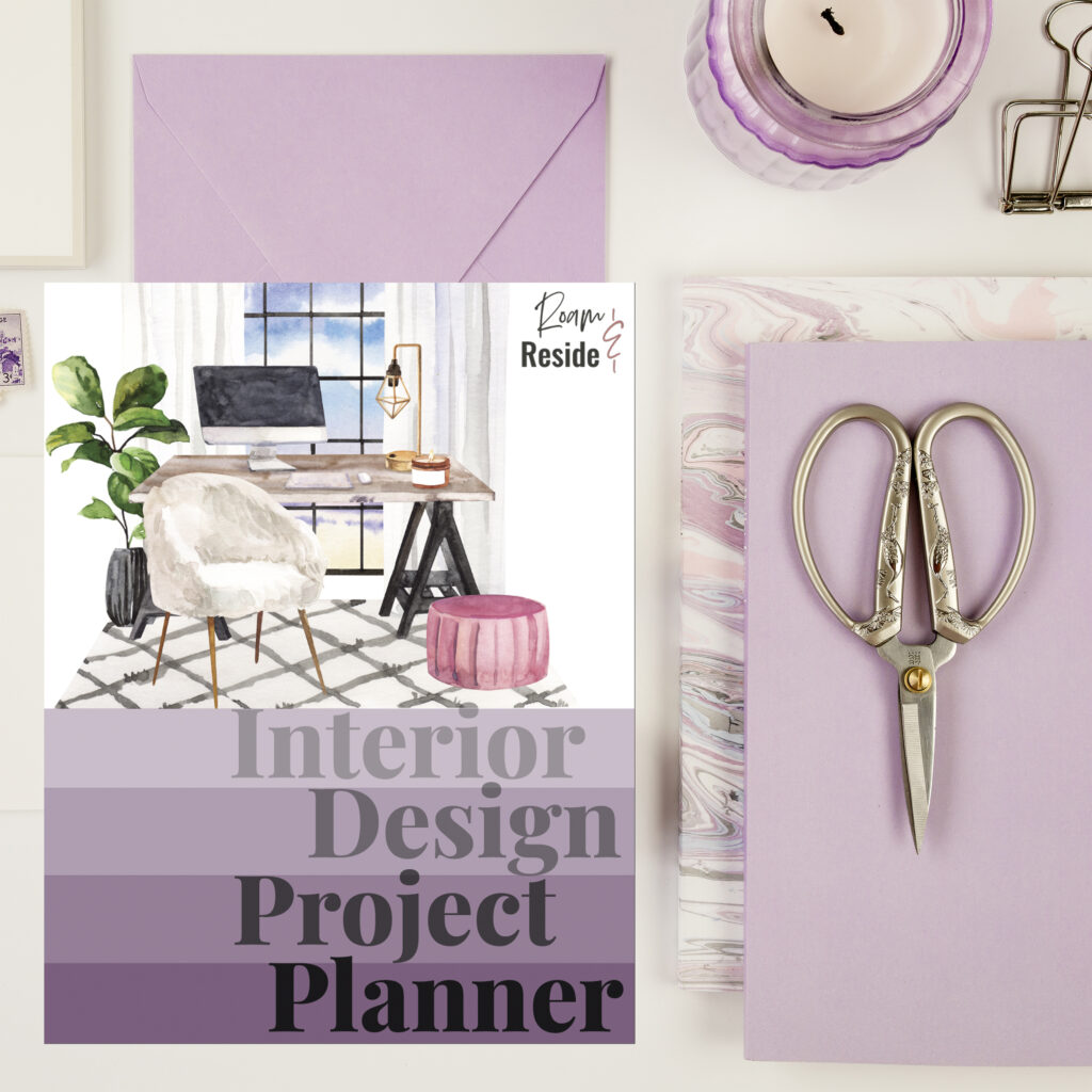
Color Chaos, Meet Your Match
Still staring at five paint chips and a Pinterest board named Maybe Someday?
My Interior Design Project Planner was made for moments like this.
Think of it as your stylish sidekick: the one who takes all your pretty piled-up Post-its and turns them into an actual plan. It’s the tool that turns your inspiration into action.
Whether you’re redoing a room or your entire life, this planner will help you go from “I love this vibe” to “Look what I actually did.”
☀️ Ready to Steal Some Sunshine?
Whether you’re a color minimalist or a full-blown pink-door maximalist, there’s a Palm Springs palette that fits your style and your space. You don’t need a pool, a vintage convertible, or a desert zip code — just the right hues, a little confidence, and maybe one bold paint swatch to get you started.
Still color-curious? Keep exploring:
- 🌴 My Aesthetic Travel Guide to Palm Springs — for inspo straight from the source (including the best doors, drinks, and design details).
- 🪩 Inside the Parker Palm Springs — a full tour of one of my all-time favorite hotels, and a masterclass in bold interiors done right.
- 🌾 Prefer cozy over citrusy? Check out my Modern Cottagecore Color Palettes for something softer, earthier, and just as styled.
Bold looks better than beige. You’ve got this.
