Are you confused by all the conflicting decorating advice you’re hearing? Which statements are decorating myths, and what design advice should you actually be following?
Many self-proclaimed “experts” are spouting out all sorts of random rules and restrictions when it comes to design.
“Gray is in!” …no wait… “Gray is out!”
“Everything should match!” … “Nothing should match!”
It can sometimes feel like you’re a ping pong ball, bouncing back and forth trying to figure out what you “should” and “shouldn’t” do to avoid having a home that’s a hot mess!
It’s almost enough to make you throw your hands in the air and resign yourself to living in a bland beige box.
Wait, stop right there. I certainly don’t want that to be your bleak decorating fate! So let me fill you in on a powerful secret when it comes to interior design.
I don’t want you to buy into these arbitrary “design myths” that various voices are shouting out into the universe.
If you want real design advice, be sure to join my Designer Insider group here.
The Real {Design} Deal
Here’s the deal. Everyone wants a quick fix, a simple formula that guarantees style success. But unfortunately, that’s not how life – and certainly not how design – works.
Why’s that? Because each space is unique and has many factors to consider – such as the size of the space, height of the ceiling, amount of natural light, and so on.
So there’s no “one size fits all” solution that will work for each and every space.
Sure, it probably sells a lot of magazines to flash a catchy headline like, “Do these 3 simple things for a perfectly beautiful home!”
But think about it, when it comes to decorating any room, are there ever only 3 simple decisions you need to make?
Heck no! If you change the bedspread, suddenly the paint color on the wall looks a little funky. So that’s gotta change. And if you choose an accent color darker than the original one, now you’ve gotta add more lighting to compensate.
So you purchase a table lamp and then realize you need to buy a new table to set the lamp on. And on and on it goes.
But the good thing is that throwing out all these random rules is going to give you the freedom to be creative and to make the most of your space.
So let’s take a look at four of these design myths. I’ll show you how limiting they can be and how there’s a better way to make decisions for decorating your home.
Myth #1: Never use dark colors in a small space.
This myth has been tossed around a lot. In fact, many of my students ask similar questions like, “I’ve got a really small room. So is it best for me to just paint it white and have a lot of light-colored furniture?”
Um…I suppose you could, if you want to always walk on eggshells and have an on-call maid service. Then, sure, white-on-white could work out really well for you.
But if you’re the sort who likes to chill with a glass of red wine or a piece of dark chocolate from time to time, you might want to reconsider that approach.
Now, I understand the fear of dark colors. They’re not subtle – they’re bold. But when done well, they can be stunning and dramatic. They make a big statement. And sometimes, that’s exactly what a space needs!
Design Myth #1 – Busted!
Alright, let me walk you through two examples that bust this myth and will allow you to be much more creative with your color choices!
Moody Minibar
Let me break this myth with one of my favorite super dark and moody moments. This is the entry into the guestroom at the NoMad Hotel in Los Angeles. It’s a tiny space that lives between the bathroom and bedroom in one of their suites. And it’s got this little moment of perfection found right here in this mini-bar area.
If you want to read more about this incredible hotel, check out my virtual tour here.
This small space is completely enveloped in this fabulously murky emerald green that covers all the walls and even the ceiling. All of the trim and molding is also covered – but is done in a more glossy sheen, which helps to reflect light and adds moments of highlights that help to break up the monotone color.
When working with dark colors, be sure you’ve got windows to bring natural daylight into the space. That’s essential to pulling off this look.
Design details add dimension to the space. For example, the architectural details with the golden trims and moldings here accentuate the color. And using a slightly glossier sheen on these trim surfaces also enhances the space.
A Window to the World
Here’s another fun colorful space. This is a narrow little elevator lobby in the Nomo Hotel in Soho, NYC. When I stepped out of the elevator and discovered this little design moment, it brought a bit of a smile to my face.
Bright blue can be a tough color to pull off in an interior space. It’s a big commitment. And it probably wouldn’t be the first color I’d suggest you pull off the shelf and go to town repainting your room.
Can you look at this space and identify two reasons this color works here?
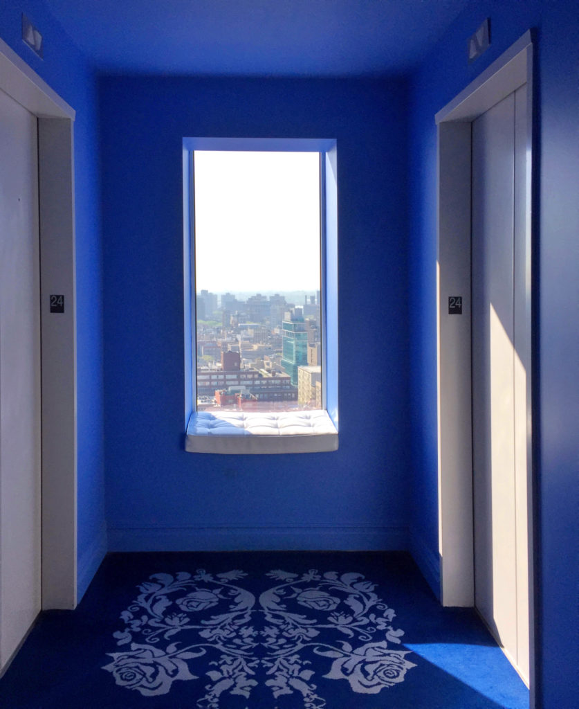
First and foremost, this delightful little window seat works, almost like the perfect piece of artwork. I mean, a great view of NYC is worth almost as much as a Monet (especially in today’s real estate costs).
And that daylight streaming through the window adds enough ambiance so that the room doesn’t feel dark and eerie.
And the second reason? It all comes down to the strategic use of white in the space. The glossy white covering the doors, trim, and even the window seat cushion are all quite strategic moments void of color. These elements all work together to balance the intensity of the bold blue.
Note the differences between these two spaces. One is tone-on-tone marine green with a dark wood floor. The second is a bold primary, blue contrasted with bright white.
Two very tiny spaces, two very different design approaches with drastically different color palettes. And yet both are absolutely delightful interior spaces.
Think how bland and boring both of these would be if the designer had been more timid and had just painted the walls beige and the ceiling an expected white.
Now, that view of NYC would still be great. And the minibar in the entry would still be quite nice.
But they would be forgotten moments. Certainly, nothing that you would remember from your stay.
Myth #2: Furniture Must Match
How many times have you heard someone spout off the phase that everything in a space has to match…?
In theory, it sounds like a good idea. You pick something you like, then rinse and repeat. It’s safe. There’s little risk.
But it’s rather boring and also a bit redundant.
Matching sets of furniture are usually at the top of every professional interior designer’s “no-no” list!
And trends are certainly not in favor of this outdated look. Conversely, styles that are more diverse and eclectic are all the rage in home decor these days.
The best approach is to create a curated assortment of pieces that coordinate but don’t look like you went out and bought a matchy-matchy set of furniture directly off a showroom floor.
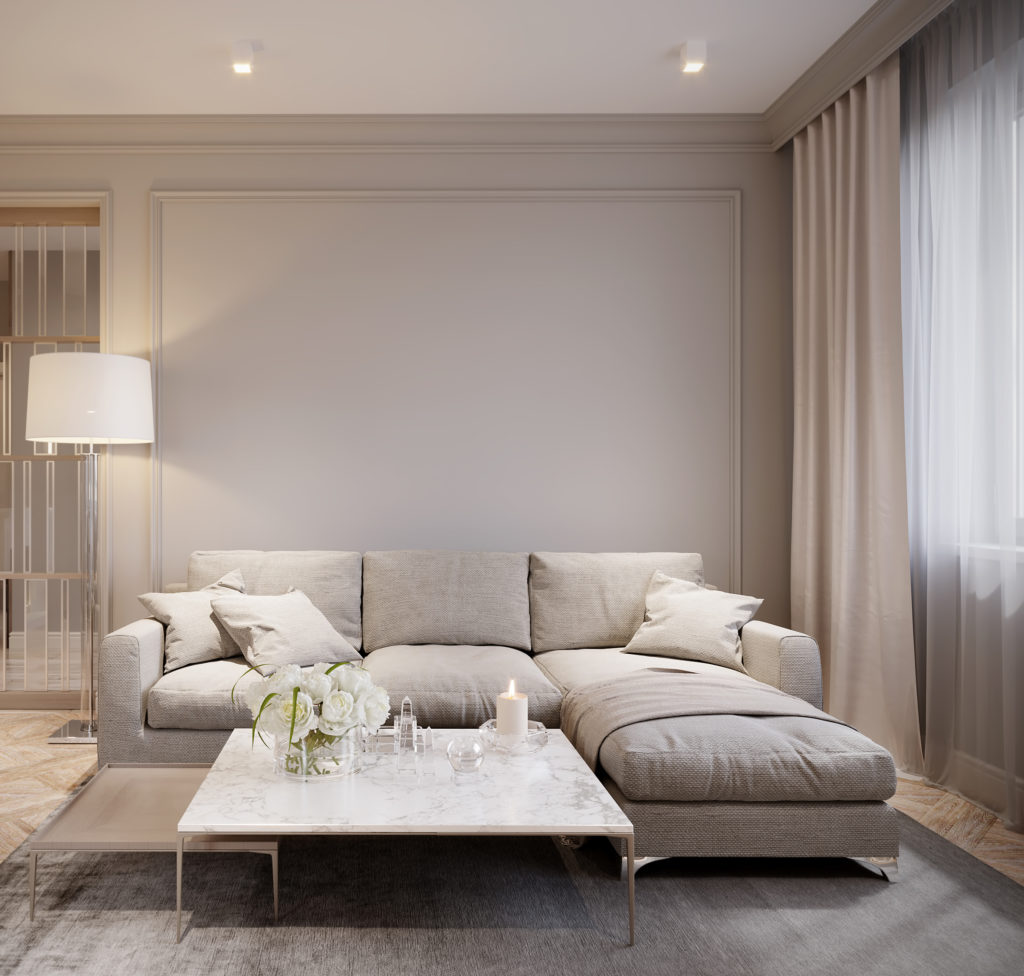
Matched Furniture Sets
Here’s an example of a sofa and two lounge chairs with the exact same styling – the same silver metal frame and leather cushions. Now, let me be clear here, there’s nothing wrong with this arrangement. Does it work? Sure, it’s alright, but it could be a lot better.
Let’s take a look at another “safe” matching space. This room is also a bit of a yawn. You see the same side tables, the same table lamps, and the same silver consoles up against the back wall.
While this is clearly a successful execution of a symmetrical layout, it’s all pretty basic, neutral, and boring. The only variety is coming through in the accessories, and even those are rather subtle.
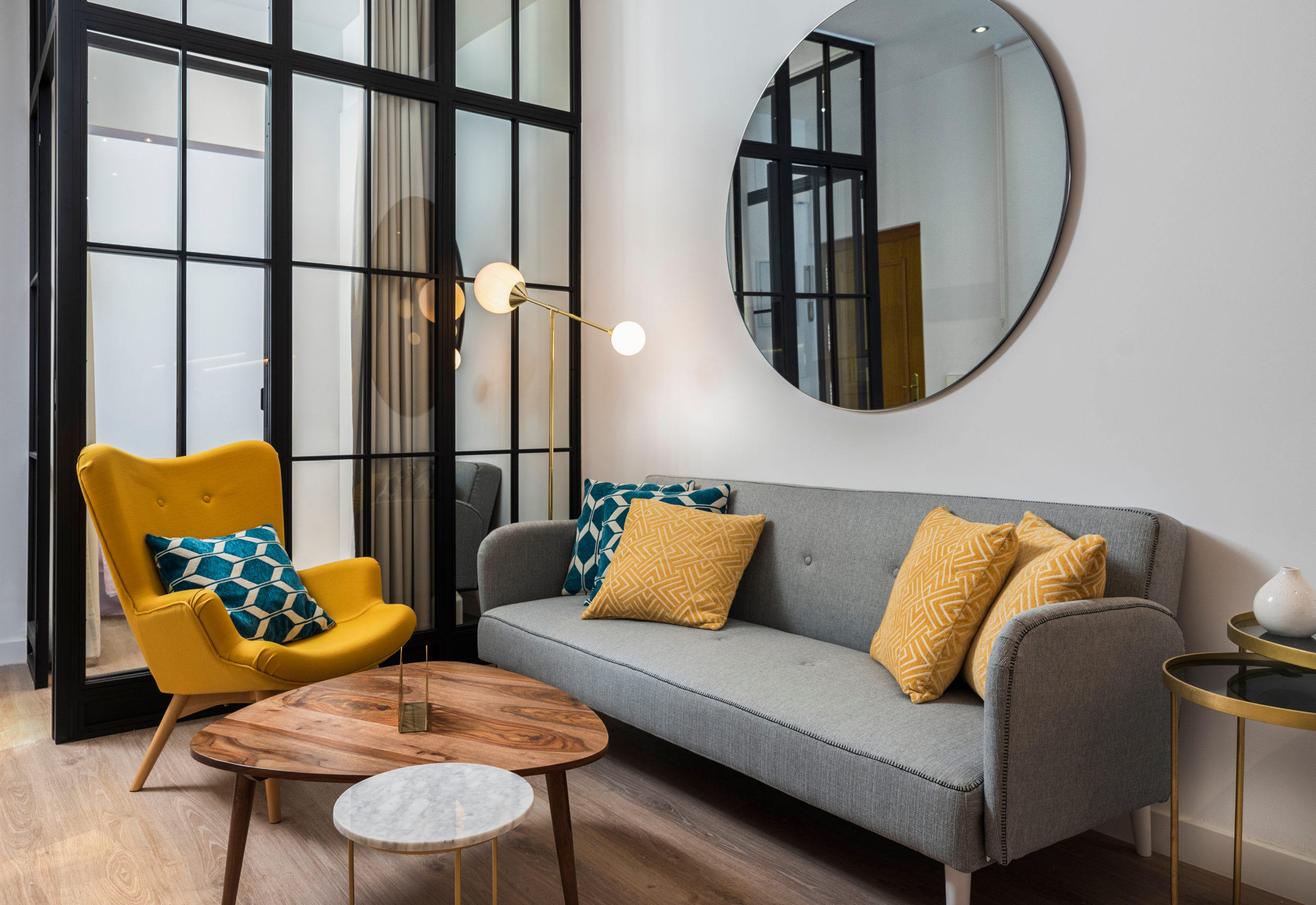
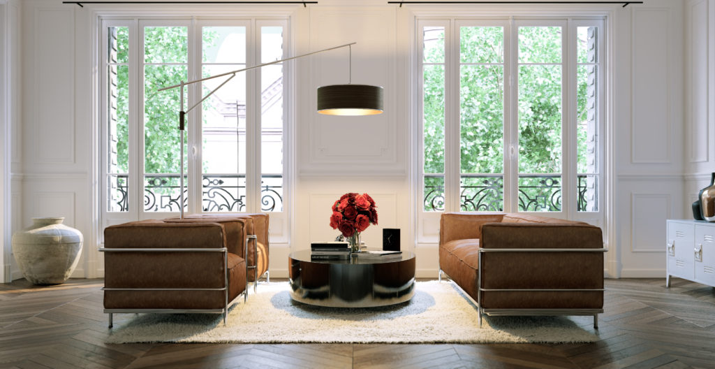
Designed Furniture Groupings
Now let’s take a more curated approach. Check out the furniture grouping below. This is a much more diverse assortment.
Design Myth #2 – Busted!
There’s no twinning happening here! Each piece of furniture is unique and has its own look. And the overall grouping feels much more dynamic and interesting.

While each piece is different, did you also notice that these pieces aren’t random and haphazard? They carry some synergy and common design details that make them all feel like they go together. Can you identify these unifying features?
First – they all have a subtle mid-century styling within their design details. And second, you’ll see the curvilinear quality to their forms is a consistent quality that makes them all jive together.
When you have those similarities, you can have some fun mixing different colors, fabrics, forms, and even materials.
Look at that cluster of coffee table shapes. One is a circle, and the other is a more organic shape. Quite the combo that nest well together!
Myth #3: Only use white for Ceilings
Another well-worn decorating proclamation states that you should only use white for ceilings. Nothing else!
Who is making these decorating decrees? Sure, most residential ceilings are white, but they don’t have to be that way!
Design Myth #3 – Busted!
Check out this room. This photo was taken a few years ago from one of my favorite spots in New York City, the Nomo hotel (the same place where we busted Decorating Myth #1).
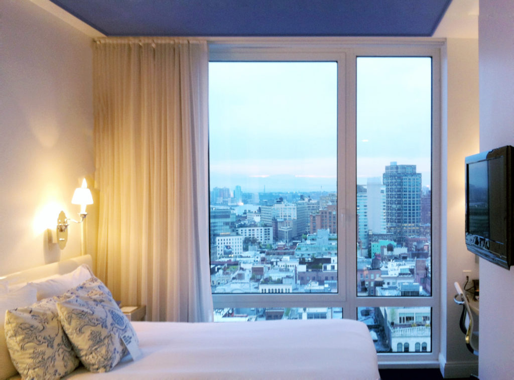
Now, if you’ve ever hung out in NYC, you know that most hotel rooms are itty bitty – and this one was no exception.
However, this design maximizes these huge windows and fantastic city views. The walls are all kept very simple and white. The only color comes in the toile fabric on the throw pillows on the bed and the vivid blue paint on the ceiling. It’s fun and unexpected, and it makes the room feel really special!
Now, hold onto your paintbrushes! I’m not recommending that you go out and paint your ceilings bright cobalt blue. But I hope this example gives you the confidence to be a little more open-minded with your paint color palettes –and surfaces in your home.
(And one other tip. Scroll back up to Myth #1 and take a quick look at the photos again. Notice anything interesting back up there…go ahead, scroll up, I’ll wait right here…
…yep, both photos feature very dark-colored ceilings! Did you notice that the first time? Again…more justification for bold colors!)
Myth #4: All Metals Must Match
Throughout the decades, there have been many loud voices demanding that “All metals must match.”
Here’s looking at you, shiny brass from the 1970s (that we’re still trying to get rid of all these years later!).
The 1990s kept that matched metal theme going even after everyone finally decided to ditch the brass and go all-in on brushed stainless.
Are you sensing a recurring theme coming through here? There are a lot of matchy-matchy rules being commanded in these myths.
Let’s examine this one and break it down.
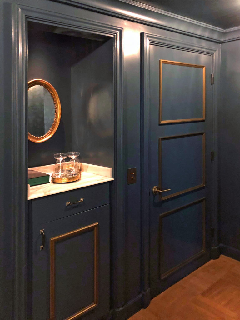
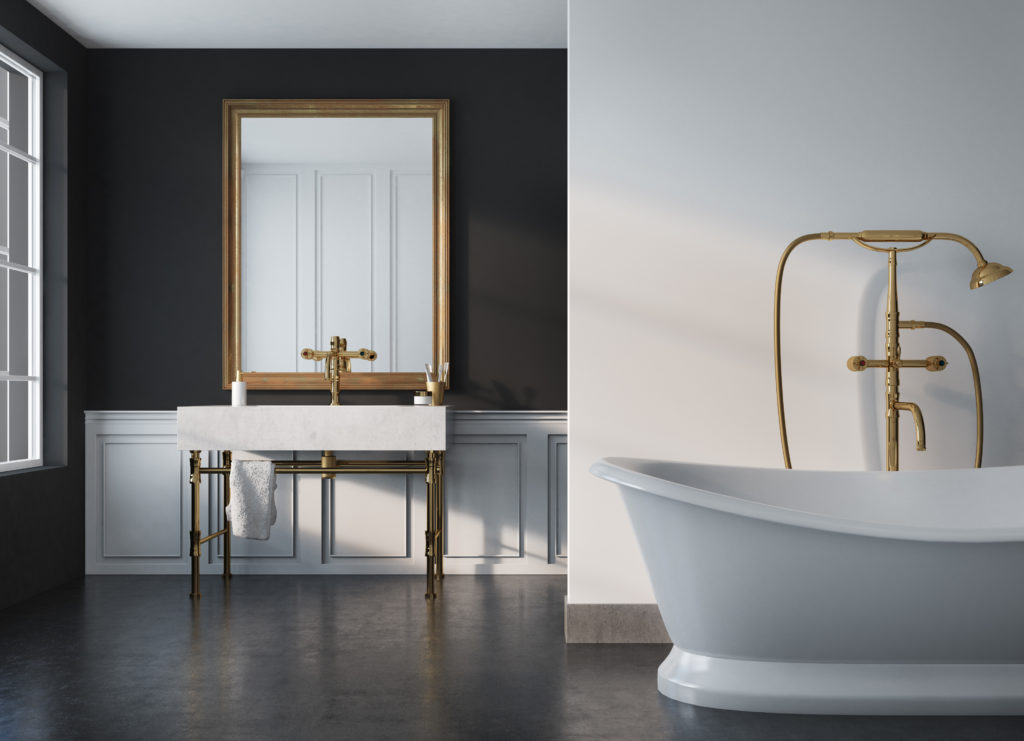
Brass Is Back
Now, I’m certainly not saying that you cannot match your metals. In the bathroom below, the brushed brass finish looks beautiful in the neutral bathroom and adds a nice touch of glam to the design.
Mix It Up
But metal finishes are a powerful tool in design. They bring in a touch of glam and sometimes even add a sparkle quality that brings a sense of luxury and highlights touchpoints in the space.
So I want to encourage you to have some fun. Don’t feel restricted to only using one metal finish at a time. Trends today are much more freeing and forgiving with a mix-and-match approach!
Design Myth #4 – Busted!
How many metal finishes can you count in this living room space?
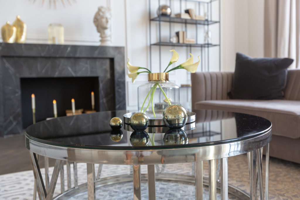
The coffee table is finished in a brushed pewter. There are gold and brass accessories on the table and fireplace. And if you look in the back of the room, you’ll see a blackened metal shelf.
This mixed bend of metals adds a rich diversity to the finishes in the living room. And the thin darker metal structure in the bookshelf is a nice contrast to the mass of the stately black marble fireplace.
Mixed Metals in the Master
This mix of warm and cool metals works quite nicely in a master bedroom.
Do you see how the reflective chrome envelops the velvet upholstery on the headboard? And the golden trim takes a basic white wall to a luxurious focal point within the room.
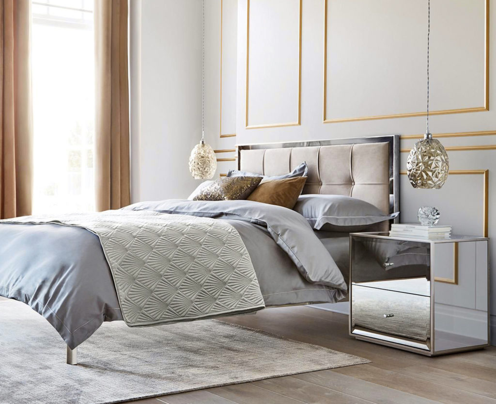
If you eliminated the gold details, the space would have a very cool feel, which wouldn’t be as inviting. Instead, those touches of gold add just the right amount of warmth to the overall environment.
And finally, those two hanging light fixtures are like the perfect pair of glimmering earrings. They frame the bed and add just the right amount of bling to the overall composition.
Decorating Myths – The Truth & Reality
Now that we’ve questioned and dispelled these decorating misconceptions, I hope that you’ll feel free to take a few more risks and make some bold moves with your decorating decisions.
Don’t believe every random rule someone throws out at you in a magazine or on a decorating TV show.
They’re well-intentioned guidance. But more often than not, they can stifle your creativity and compromise your designs.
I want the best for you and for your home. So get out there, and let your creativity run free as you decorate the home of your dreams!
For more interior design tips, be sure to sign up to join my Designer Insider group here. And also check out my free interior design style quiz.


