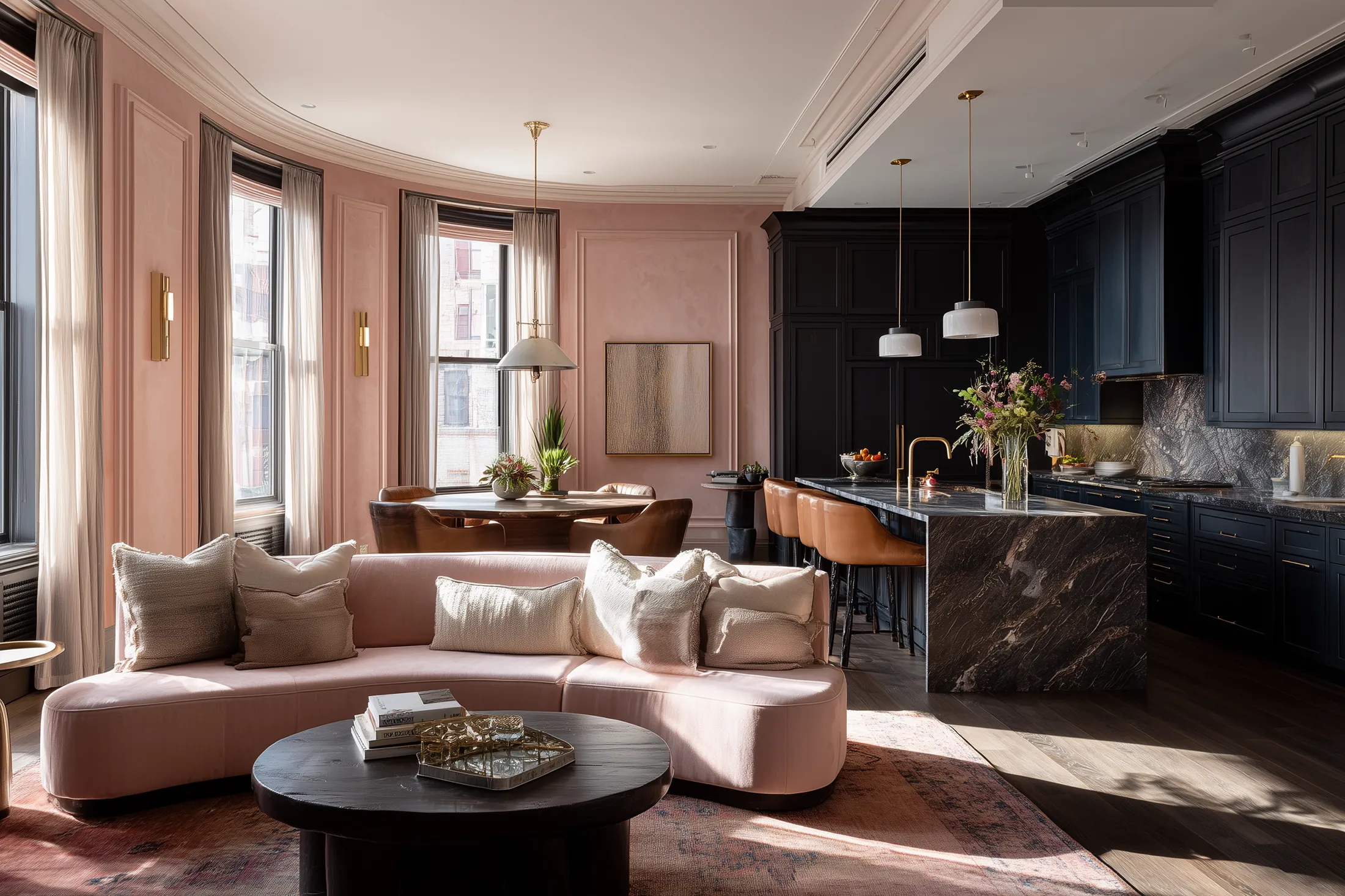
The blush pink aesthetic color trend is evolving beyond Millennial Pink in home decor. It’s now softer, warmer, and more chic than ever. From velvet sofas to matte walls and sculptural sinks, here’s how to use pink without getting too sugary-sweet. Full palette pairings, styling tips, and real design inspo inside.
This post may include affiliate links. If you choose to book through them, I may earn a small commission at no extra cost to you.
Blush pink has been declared “over” more times than we can count. And yet… it keeps showing up. Quietly. Elegantly. Endlessly adaptable.
From Millennial Pink to Modern Neutral
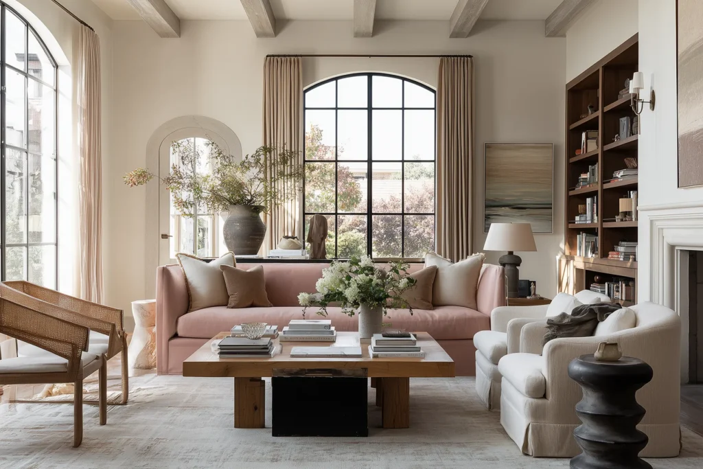
Blush pink has had more comebacks than a pop star in her reinvention era. Every few years, someone calls it over — too girly, too Instagram, too millennial — and yet? Here it is again. Softer, smokier, and more elevated than ever. No longer sugary-sweet or overly feminine, today’s blush reads as quiet luxury. Warm. Muted. Matte. It’s the kind of color that flatters a room the way good lighting flatters a face.
Before we dive in, I’d suggest you grab my free Pink Palette guide, it’s got all the goods.
Your Free Guide to the Blush Pink Palette
Everyone wants the soft, expensive-looking blush interiors they keep saving on Pinterest.
But have you ever thought, “Okay… but how do I actually pull this off in real life?”
That’s where this guide comes in.
Inside, I break down the exact paint colors, palette pairings, and design decisions behind blush spaces that actually work — the kind that feel warm, layered, sophisticated, and just a little emotionally unattainable.
Because the difference between “Chic Parisian apartment” and “teen skincare aisle” is usually one undertone.
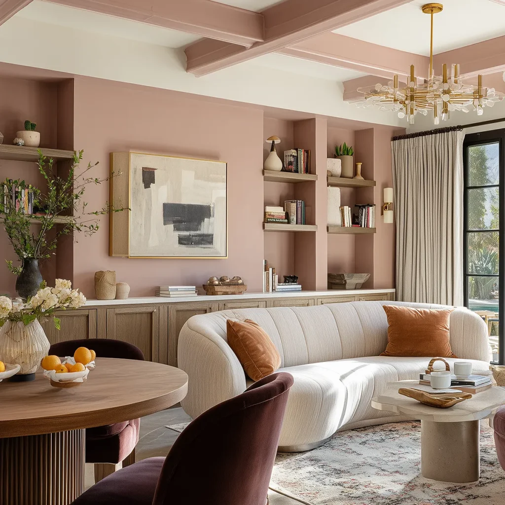
Why Is Blush Pink Aesthetic Color Trend Happening in Interior Design?
The truth is: Blush pink never really left, she just got quiet while everyone flirted with white-on-white everything. But now? She’s rested, radiant, and ready for her quiet luxury era.
In a world that feels constantly chaotic, blush pink is the design equivalent of a weighted blanket. Cozy, nostalgic, and easy on the eyes; almost like a color you half-remember from your favorite childhood bedtime book. It doesn’t scream “look at me!” It says “you’re safe here.”
Blush pink taps into the same cultural craving that’s fueling cottagecore and Grandmillennial style: softness, comfort, and the illusion of simpler times.
You can see more of my take on the cozy cottagecore aesthetic and see how blush pink plays into some of its best color palettes in this post. And for a cozy cottage nursery in a baby soft pink, click here.
Blush Pink: The Nearly Neutral with a POV
Blush pink works because it’s what I call a nearly neutral. It’s soft enough to calm a room, but with just enough saturation to give it a point of view. Beige may be basic, but this blush has personality. It plays well with others, but still knows how to stand on its own.
Let’s be clear: blush pink is not Barbie. It’s not bubblegum. And it’s definitely not flamingo. Blush is subtle. It’s warm, earthy, slightly dusty — like rose quartz with the saturation dialed way down. It lives somewhere between beige and mauve, which is exactly why designers love it: it’s color and neutral, all at once.
Blush pink behaves like a neutral, but it always brings a little something extra. There’s warmth. Depth. A softness that still reads sophisticated.
Millennial Pink Grew Up
Millennial pink had a moment. Scratch that—millennial pink had a movement. In the mid-2010s, it painted every cool café, Glossier showroom, and even in the matcha lattes you saw on Instagram. It was punchy, youthful, a little ironic—and totally unforgettable. But like all trends that burn hot, it eventually faded.
Except… it didn’t disappear. It evolved. Today’s blush pink is quieter, earthier, and far more versatile. The gloss is gone, the tone’s been turned down, and what’s left is something designers can actually use. The blush pink we’re seeing now is softer, smokier, and far more livable. Less fashion, more foundation. Less millennial, more modern neutral.
It’s no longer here to be cute—it’s here to be useful. Designers have learned how to work with it, not just around it: pairing it with travertine, oak, limewash, and soft shadow for interiors that feel warm, confident, and beautifully grown.
Consider Blush Pink an upgraded rebrand from Millennial Pink: a little less frosé, a little more rose clay.

The Blush Pink Aesthetic: The Color of Quiet Luxury
Blush pink is beloved by designers for one very good reason: it makes everything around it look better. It brings softness to modern lines, warmth to cooler tones, and texture to minimal spaces. You can pair it with wood, travertine, blackened bronze, or boucle and it never feels forced. It’s emotionally warm but aesthetically calm—a rare combo in the color world.
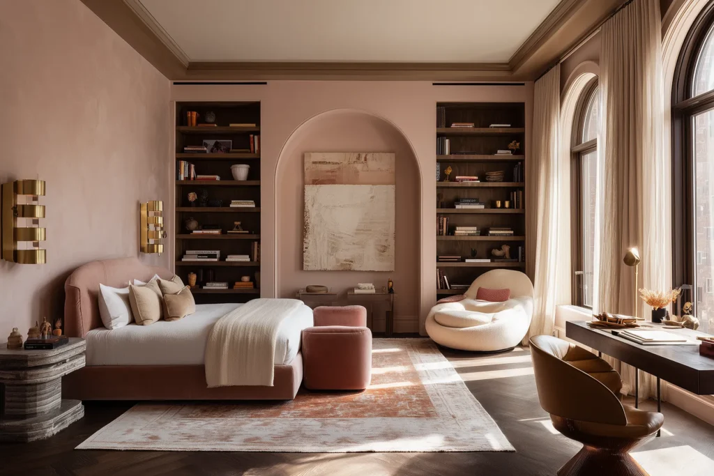
It’s soft, warm, and camera-ready. Designers keep returning to blush pink because it plays well with others. Wood, marble, brass, stone—it softens them all. It adds warmth to minimal spaces, depth to neutrals, and softness to stark modernism. It doesn’t dominate the room; it makes everything look better.
Where Blush Pink Looks Best: Bedroom, Kitchen, and Bathroom Ideas
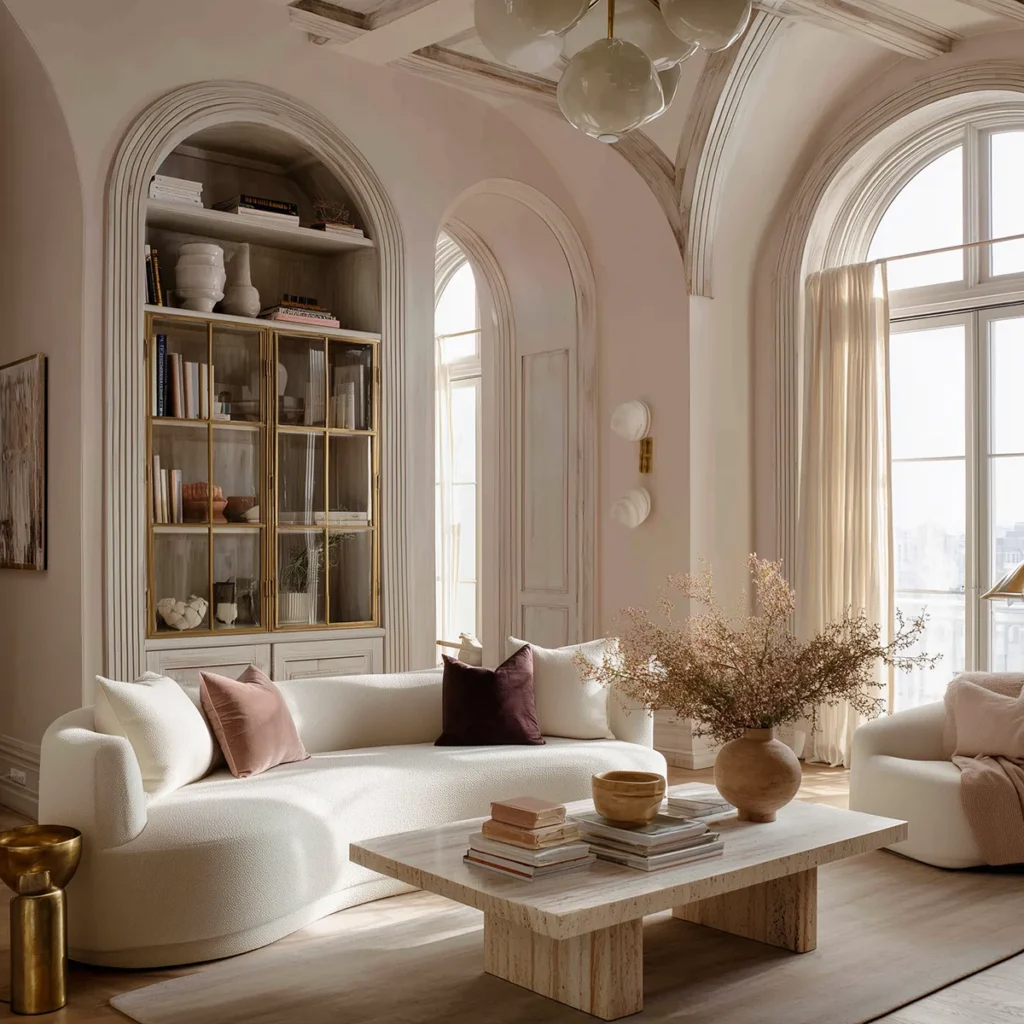
Blush pink has left the nursery and now confidently roams the house. In living rooms, it’s showing up in sculptural sofas, curved plaster fireplaces, and velvet accent chairs that feel indulgent without screaming. In bathrooms, we’re seeing pink zellige tile, rose-toned marble, and muted terracotta sinks—softened by brass hardware and natural light.


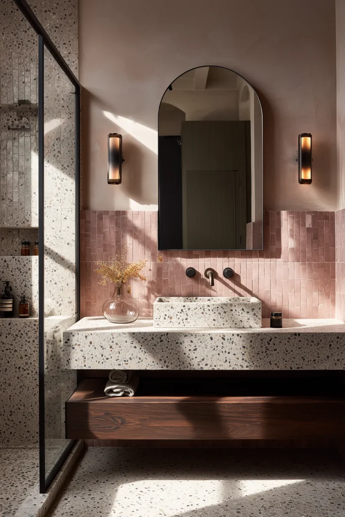
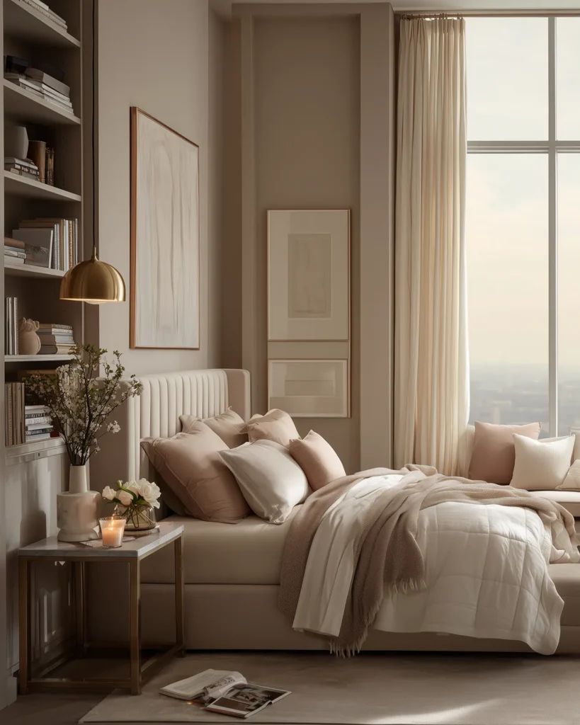
It’s surprisingly effective in kitchens, too: matte blush cabinetry, terrazzo countertops with pink flecks, and even blush-tinted limewash walls. And in bedrooms? Always a good idea. A muted blush headboard, pale pink linen, or dusty clay-toned walls instantly make the space feel more personal, more restful.
Even commercial spaces are joining the movement. Boutique hotels, wine bars, art-forward salons—are going all in. Blush pink doesn’t just work across styles. It elevates them.
Designers are also painting front doors in warm, clay-like blush tones as a subtle sign that something thoughtful lies beyond. It’s a small detail that makes a big first impression.
Where Should You Use Blush Pink In Your Home?
Anywhere you want a whisper of color without the full paint commitment. It adds color without conflict. It shows up in all the right places: plaster walls, terrazzo tile flecks, velvet headboards, lacquered cabinets, and even friendly front doors. It’s a low-stakes way to bring in a touch of playfulness, even in the most grown-up homes.
How to Style Blush Pink in a Modern Home
Designers often treat blush like a neutral, but they surround it with rich, grounding materials that give it context. Think serious millwork—walnut paneling, oak cabinetry, fluted pine built-ins. A pale blush wall next to a honey oak herringbone floor instantly feels more French apartment than fairy princess. In kitchens, blush lower cabinets with honed travertine countertops and aged brass pulls strike the perfect balance between warm and refined.
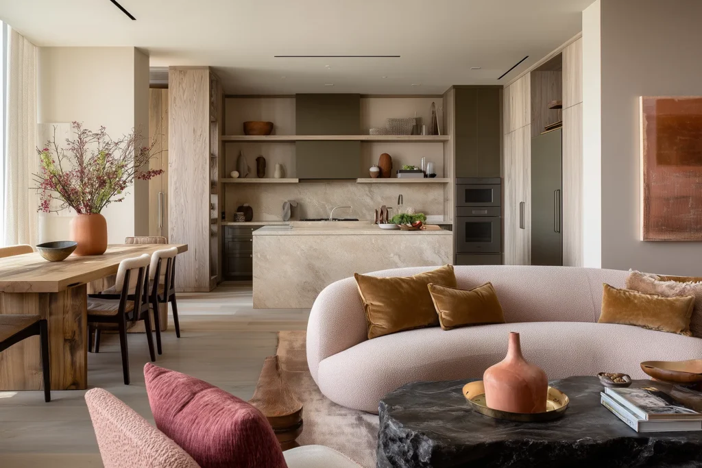
You want your blush pink to feel sun-warmed and natural, like the inside of a seashell or a faded clay pot—not like cotton candy. Avoid icy tones or anything with a blue-lavender base. Those tend to feel flat, juvenile, and overly sweet.
And let’s talk about texture, because this is where blush pink really gets interesting. A chunky boucle armchair in warm rose brings that chic, Chanel-meets-interiors moment—structured, soft, a little bit fashion. A velvet sofa in clay-pink makes an open space feel instantly cocooned. And don’t overlook rugs: a vintage Persian or low-pile wool rug with subtle blush undertones can tie a palette together in a way that’s totally grown and totally un-sweet.
You can even bring blush pink into smaller accent moments—like a tiled fireplace surround, a powder room sink basin, a plaster pendant lamp, or a front door in sun-faded rose.
The Best Blush Pink Color Combos
Pair with deep mushroom, tobacco brown, mossy green, or chalky white for contrast that feels intentional, not juvenile. And if you want edge? Throw in black. A blush room with matte black hardware or an oil-rubbed bronze light fixture suddenly feels like it has an opinion—and not a meek one.
The most interesting blush pink rooms lean into contrast. Black is the obvious partner and the best one. Matte black walls, lacquered black millwork, blackened bronze fixtures — any of these will take blush from sweet to serious in one move. The darkness gives the pink somewhere to push against, and the result feels intentional, considered, a little bit dramatic.
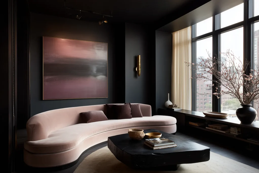
But black isn’t the only option. Deep forest green and blush is an underrated pairing — rich, botanical, slightly maximalist. Chocolate brown grounds blush without hardening it. Even a deep navy, used sparingly, adds depth without killing the warmth.
The rule: blush pink needs contrast to show its range. Pair it only with other soft tones and it disappears into the wall. Give it something to stand next to — something darker, richer, bolder — and it earns its place in the room.
One last tip? Embrace shadow and natural light. Blush pink changes beautifully depending on the time of day. In the morning, it’s fresh and luminous. In the evening, it gets sultry and rich. Let that transformation work for you. A well-placed blush tone in a well-lit room does half the work on its own.
Blush pink doesn’t need to dominate the room to define it. The goal is to ground the softness with structure. When done well, it feels like a design decision, not a theme. And that’s where the magic is.
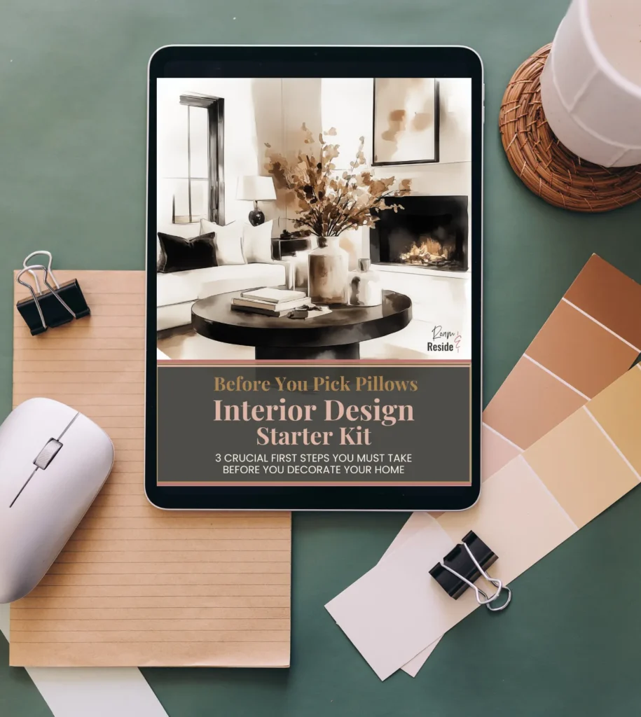
Need a Little Design Assist?
Blush pink paint is only going to be as good as the room it lives in.
I’ve seen so many people fall in love with a color and still end up with a space that feels off because the vision wasn’t there first. That’s exactly why I created the Interior Design Starter Kit.
It’s simple, fun, and helps you figure out three things every room needs:
- What you want it to feel like
- What’s working (and what’s not)
- What style actually fits you
Paint is only part of the story. Start with your vision, and everything else falls into place.
Grab your Starter Kit for just $9.
✈️ Where to See the Best Blush Pink Aesthetic IRL
Need proof that blush pink is design gold when done right? Pack a carry-on and cue the camera roll — here are a few of my favorite “in the wild” moments (real-world spaces) where I soaked up the best of blush in all its rosy glory and am sharing it here for you to enjoy.
A Blush Birthday Brunch
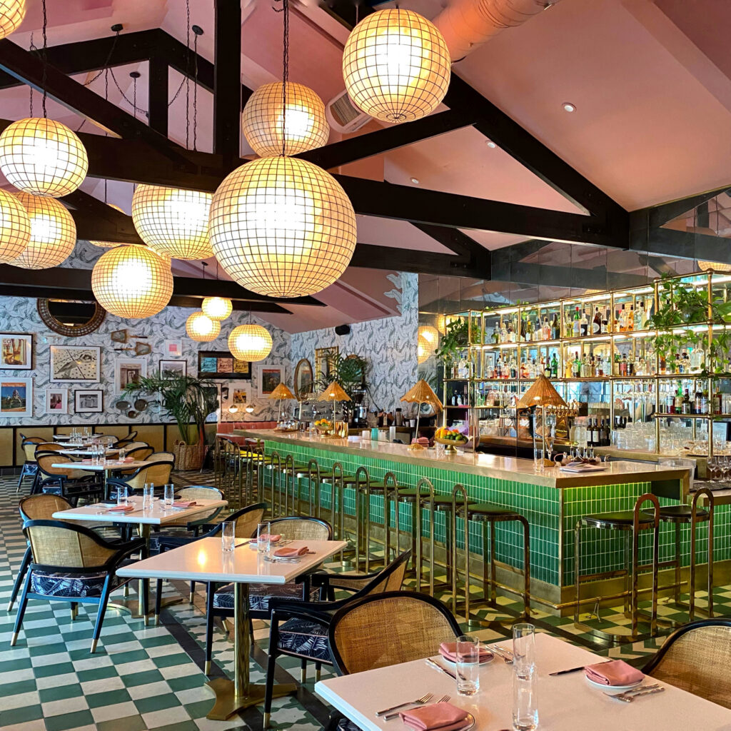
📍Pink Cabana, Indian Wells/Palm Springs
This was, without question, my best brunch moment and also, the setting for a milestone birthday, which only made it feel more iconic.
The Pink Cabana has that magic Palm Springs formula: rosy details, glossy green tile, glowing lanterns, and just enough old-school desert glamour to make the whole room feel like a celebration before the first drink even hits the table.
Stay at the Sands Hotel, bask in a cabana, order something sparkling, and really make the most of it.
And if you want more where this came from, you can check out the full list of my favorite Palm Springs color moments in my aesthetic travel guide.
Blush pink, but make it historic.
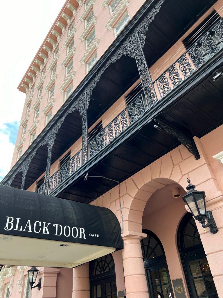
📍The Mills House Hotel, Charleston
If blush pink has a grand dame era, this is it.
There’s nothing timid about this shade of blush on the Mills House Hotel. Against the building’s bold black ironwork (and especially those incredible balconies!), the color feels grounded, glamorous, and completely at home in its historic setting.
It’s a reminder that blush pink has real staying power when it’s paired with contrast, giving it edge and keeping it chic instead of sweet.
At least stop by and grab a latte. And if you want to spend the night at the Mills House Hotel, click here to check current room rates and availability.
Blush Pink, With Better Cocktails
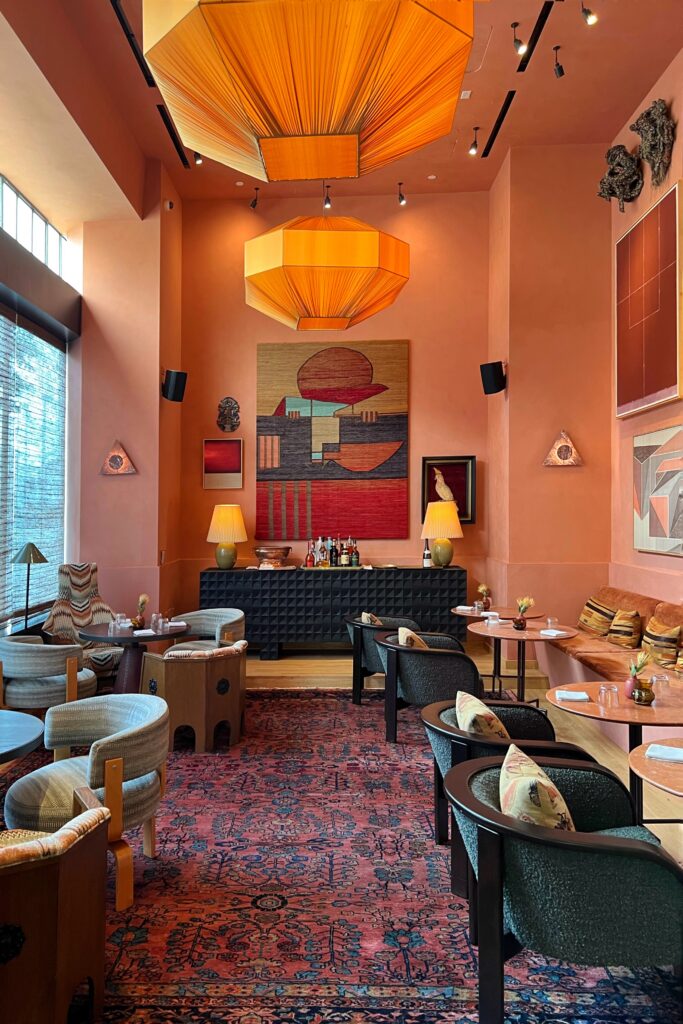
📍Dahlia at the Proper Hotel, Downtown LA
This is blush pink in its after-hours era. At Dahlia Lounge, the color gets the full Kelly Wearstler treatment: artful, dramatic, a little eccentric, and impossible to ignore.
Hidden inside the Proper Hotel in downtown Los Angeles, Dahlia Lounge has the kind of low-lit, tucked-away glamour that makes a speakeasy still feel like a very good idea.
It’s intimate, slightly mysterious, and unmistakably LA — the kind of place where the cocktails are excellent, the crowd is attractive, and everyone in the room seems either genuinely interesting or very committed to the performance of being so. In Los Angeles, of course, that’s part of the charm.
Check out the vibe for yourself by checking into the Proper Hotel. You can find current room rates and availability here.
Blush Pink, But Make It Breezy
📍The Line Hotel, Austin
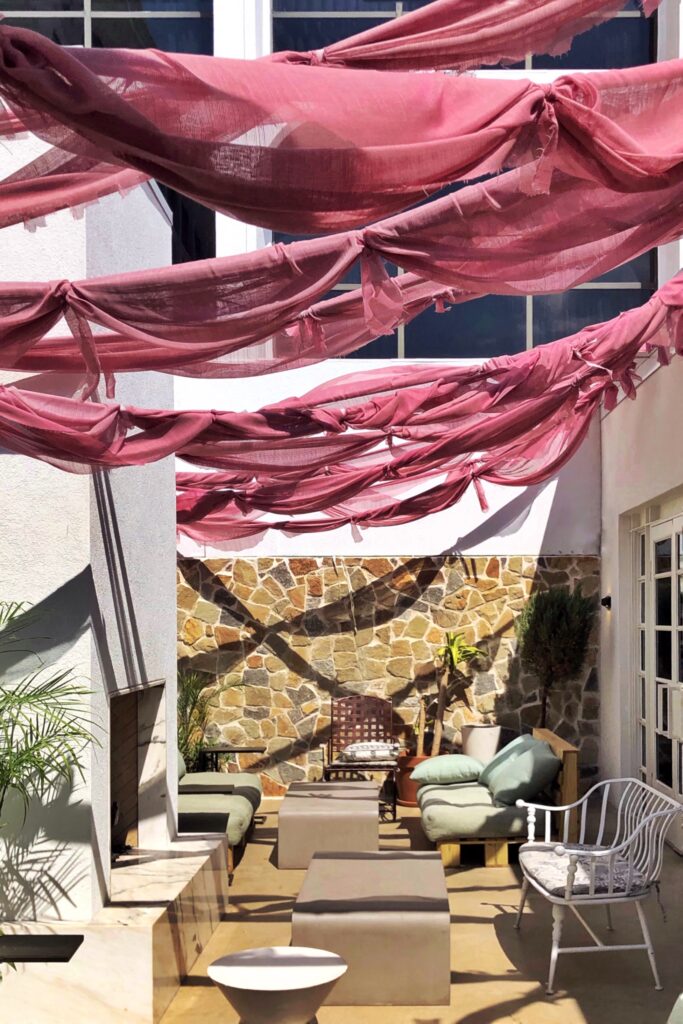
Blush pink takes a sun-day, fun-day turn at the Line Hotel in Austin, TX, with swaths of gauzy pink garlands strung across the terrace and fluttering in the breeze like soft confetti.
It’s part installation, part shade structure, and a reminder that pink can be playful, architectural, and yes, functional. Especially when viewed through oversized sunglasses with a spritz in hand.
All of it feels distinctly Austin: creative, casual, and just self-aware enough to keep pink cool.
Wanna plan a sleepover? Check current room rates and availability at the Line Hotel.
FAQ: Blush Pink Interiors, Styling & Design
Is blush pink still in style for interior design?
Yes, and it never really left. Blush pink is considered a modern neutral in interior design, especially when used with warm undertones and paired with natural textures like wood, stone, and boucle. It’s timeless, versatile, and trending in both minimalist and maximalist spaces.
Is blush pink the same as millennial pink?
Not exactly. Millennial pink was that cooler, slightly dusty pink that dominated the late 2010s. Today’s blush is warmer, richer, and feels less like a trend and more like a forever neutral.
Is blush pink just a trend or is it a good long-lasting color choice?
Influencers and media will always claim it’s either “in” or “out”, depending on the day. But the truth is that a soft pink is always in style, but undertones will shift over time. Warmer variations have proven to be much more enduring. Today, it’s evolving into a modern neutral rather than disappearing entirely.
How do I use blush pink in a grown-up way (and not make it look like a little girl’s bedroom)?
Start by choosing the right kind of pink. Grown-up blush has warmth — more clay, more rose, a little sun-faded — and none of the bubblegum energy. Then give it something stronger to push against: dark metals, real wood, stone, anything with a little weight.
What is the difference between blush pink and dusty pink?
Blush pink tends to be softer and warmer, often with peachy or rosy undertones. Dusty pink is more muted and slightly grayer, giving it a more vintage or subdued feel.
Can blush pink be used as a neutral?
Not officially, but it acts like one. True neutrals like beige and gray work because they don’t compete with anything else in the room. Blush pink does the same thing, but adds warmth that beige can’t touch. It sits quietly in the background, lets your furniture and materials do the talking, and somehow makes the whole room feel softer and more alive. That’s neutral behavior. Just with better taste.
Is blush pink a good choice for small spaces?
Yes, lighter blush tones can make a space feel soft and open, especially when paired with mirrors, reflective surfaces and excellent lighting.
Why was Millennial Pink so popular?
Millennial pink was the color equivalent of avocado toast: soft, approachable, and suddenly everywhere. It walked the line between retro and fresh, nostalgic without being cringe, and it made neutrals feel like they finally had a personality. It looked good on a wall, a sneaker, a branding deck, and even latte foam. That type of versatility is hard to pull off.
Is blush pink better as an accent or a main color?
It can work well either way; depends on the mood. As an accent, it adds warmth and softness. As a main color, especially on walls or large surfaces, it can feel immersive and atmospheric — especially when paired with contrasting materials.
What makes blush pink feel modern instead of dated?
It’s all about what you pair it with. Set against black accents, rich wood, stone, or sculptural lighting, blush pink feels fresh and elevated. Leave it surrounded by pastels or overly delicate details, and it starts to read more nostalgic than modern.
What colors pair well with Blush Pink?
Millennial pink plays surprisingly well with black and charcoal; a little grit with the grace. Burnt orange, olive green, oxblood, and muted teal all make it feel modern, not nursery.
But if you are looking for a great way to bring blush pink into a nursery, check out my Nautical Nursery post (seashells, anyone)? And also my Cozy Cottage Nursery post here.
Final Take: The Blush Is Back — But It Never Really Left
Blush pink may have once been labeled a trend, but let’s be honest — it’s earned its place in the permanent palette. It’s not just pretty. It’s powerful. The right blush brings warmth without weight, color without chaos, softness without sweet. It plays nice with wood and stone, elevates everyday spaces, and still knows how to make a statement when it wants to.

Whether it’s wrapped around a velvet chair, swirling through a tiled bar, or fluttering from a hotel canopy in Austin, blush pink always shows up with quiet confidence. It doesn’t ask for attention — it just looks good when it gets it.
So if you’re craving color but allergic to commitment, let blush be your gateway. The undertones are grown. The styling options are endless. And the vibe? Always elevated.
Next Step: Build Your Full Color Story
Ready to turn that single shade of blush into a whole palette moment? We’ve got you. Whether you’re dreaming up your next home project, building out a mood board, or just color-scouting for fun, these palettes will help you layer blush into a larger, more intentional look.
✨ Modern Cottagecore Color Palettes
For soft, natural hues with a touch of romance — think moss, clay, candlelight, and of course, a little pink.
👉 Explore the palettes here →
🌴 Palm Springs Color Palettes
Where blush meets mid-century glam. Bold pastels, sun-washed tones, and the occasional splash of citrus. 👉 See the full post here →
Color is a language, and blush pink is just the beginning.
And if you’re curious to hear my POV on why aesthetics matter, check out my story:
→ How a drink with a stranger changed my perspective on beauty.
