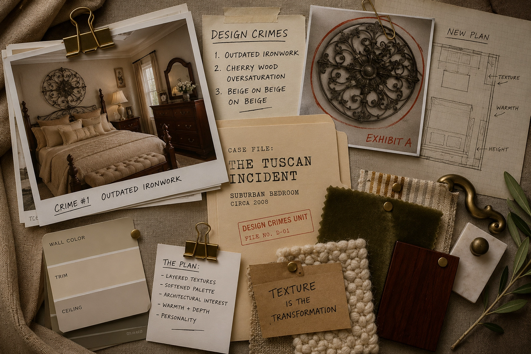
Room Roast | The Wrought Kind of Wrong
TL;DR – Wondering why your traditional Tuscan bedroom feels dated even though nothing is technically wrong with it? The culprit is often too much coordination: matching furniture sets, repetitive decor, and a lack of texture and contrast. This Tuscan bedroom makeover shows how layered materials, thoughtful lighting, and intentional styling can completely transform a traditional bedroom into an updated, modern space that feels like a boutique hotel.
Throwback: The time was the early 2000’s. This was peak Trading Spaces era.
This was a dangerous cultural moment when homeowners handed over their keys, trusted a woman named Tiffany with a glue gun, and came home to discover their bedroom had been transformed into a faux-Tuscan Olive Garden with crackle paint and existential damage.
Britney and Christina were fighting for pop supremacy.
We were all shopping at Pier 1.
And somewhere in suburban America, a furniture salesman was convincing an entire generation that every piece in a bedroom should match down to the lamps.
To be fair: at the time, this was aspirational.
Warm neutrals felt sophisticated. Matching furniture felt expensive. Ornamental iron screamed “European elegance” if you squinted hard enough.
And honestly? Some of these rooms still have good bones.
But over time, many of them became trapped in a very specific design era:
one where everything matched, everything competed, and nothing could breathe.
This room roast is not about shaming traditional style.
It’s about understanding why some warm neutral spaces feel layered and timeless… while others feel like a furniture showroom having a panic attack.

Want the Designer Cheat Sheet?
Now, I’m not one for a #SpoilerAlert, but if you want the designer cheat sheet, this one’s for you.
As we work our way through this makeover in this post, I’ll explain what wasn’t working and why.
But if you’d like the paint colors, material palette, and exact swaps all in one place, I’ve bundled them into a free guide you can steal for your own space.
Because great rooms don’t happen by accident. They happen by design.
Grab it here and steal the style formula to use in your own space.
What Exactly is a Tuscan Room Roast?
A Room Roast is my no-shame design teardown. And this one takes on an early-2000s Tuscan bedroom stuck in matchy, beige overload.
The format’s always the same: I assess the space and take its vitals (the stats, the palette, the era it got stuck in), sort what’s working from what isn’t, name the design crimes one by one, then deliver the intervention and the reveal.
A check-up, a diagnosis, and a glow-up, for a dramatic interior design transformation.
The Why Behind My Room Roasts
I roast rooms to make the world a more beautiful place. And also because decorating should be fun, not terrifying.
Somewhere along the way of watching design shows and sifting through dozens of tiny paint chips, interior design has become deeply intimidating.
Redecorating is stressful. The stakes feel high. The budget is real. And most design advice takes itself way too seriously. People are feeling like choosing “the wrong” nightstand is a moral failure.
Relax. Decorating can be fun. And funny. (So you try an idea, and it flops – okay. Been there. You fix it and move on. Or live with it.)

That’s why I’m sharing these room roasts. Not shame. Not elitism. Not “your house is ugly.” The point is to make design fun and approachable enough that people stop being afraid to decorate their spaces.
And #SpoilerAlert – be sure to scroll all the way to the end of this post because there’s an AWESOME before & after you don’t want to miss. There is hope for these wayward rooms!
Also: All images in this post are rendered by AI. Roasted by me. (Because I prefer throwing shade at pixels, not people.)
Legal Disclaimer: No actual homeowners were harmed in this roast. All design crimes depicted are AI-generated. Any resemblance to your bedroom is purely coincidental… and unfortunate.
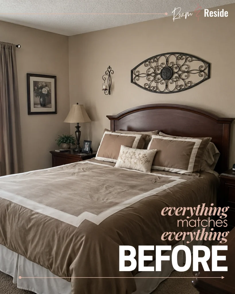
The Classic Suburban Bedroom from the early 2000’s
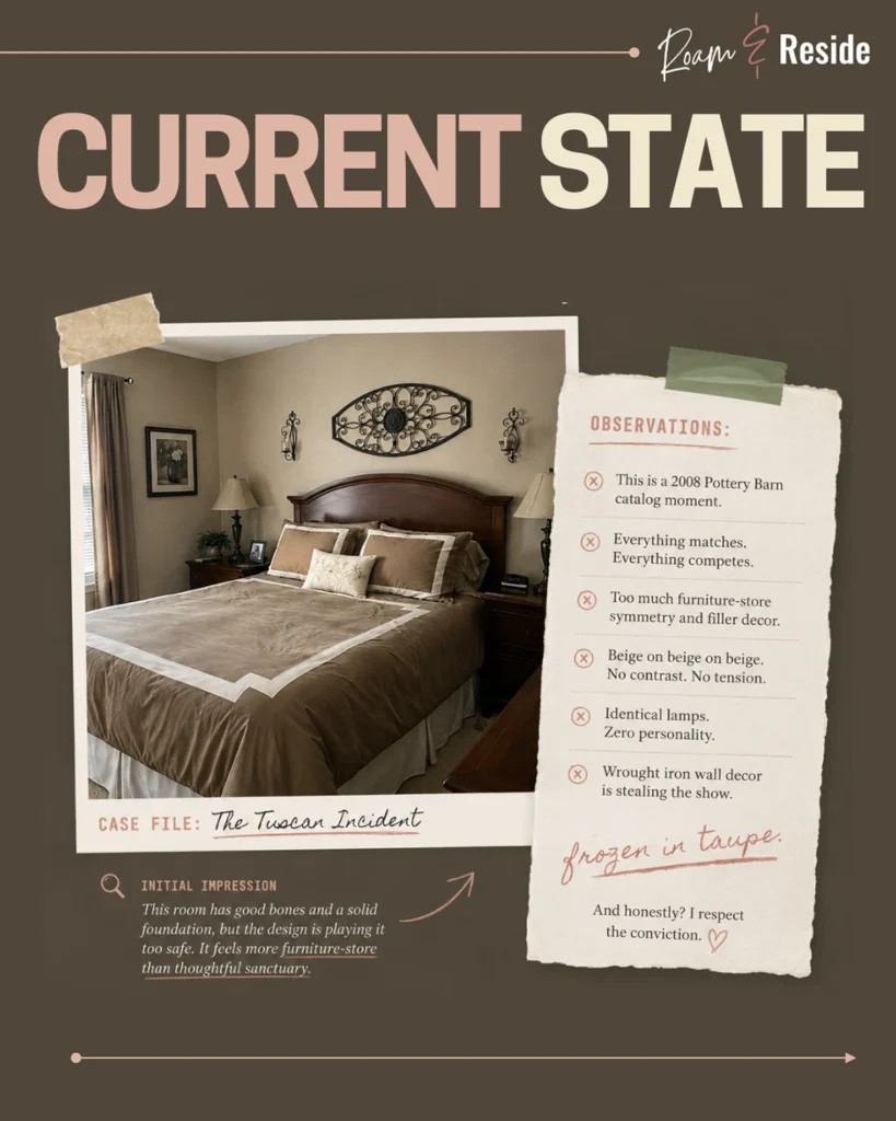
So let’s talk about this bedroom.
At first glance, this room doesn’t seem offensive. In fact, it looks suspiciously like half the primary bedrooms built between 2004 and 2011.
The problem is not that any one piece is terrible. The problem is that every single item is trying to participate in the exact same conversation.
The bedding matches the walls. The curtains match the bedding. The lamps match the furniture.
The wrought iron matches the other wrought iron.
Even the artwork feels contractually obligated to stay within the approved taupe family.
Nothing interrupts the palette. Nothing creates tension. Nothing gives your eye a reason to pause.
Back in the furniture-showroom era, matching was the gold standard. The more coordinated a room felt, the more “finished” it appeared. Furniture came in giant boxed collections with names like The Tuscany Ridge Collection — same wood tone, same curves, same hardware, same overwhelming commitment to ornamental sincerity. You bought the set. You arranged it symmetrically. You stood back and nodded.
Done. Complete. Finished.
And that was exactly the problem.
This bedroom actually has good bones: warm tones, balanced proportions, solid scale, enough natural light to work with. There’s a real room hiding in here. But it’s so committed to sameness that nothing gets to stand out. Every surface competes at exactly the same volume. Nothing leads. Nothing breathes.
The biggest misconception in neutral design is that calm comes from keeping everything similar. It doesn’t.
Good design creates contrast. That’s the difference between a room that feels like a sanctuary and one that feels like a floor display waiting to be purchased.
What Went Wrong: Understanding the Tuscan Bedroom Era
The Tuscan bedroom era peaked in the early 2000s and left a very specific fingerprint. Dark cherry wood furniture purchased as a matched set. Wrought iron wall decor — usually an oversized medallion flanked by scrollwork sconces. Walls, bedding, curtains, and carpet all within one shade of beige or taupe. Identical lamps on matching nightstands. Five throw pillows arranged in descending size order. And somewhere, a framed “nature” print that has not been looked at directly since 2009.
The result was a room that felt coordinated but not curated. Complete but not personal. Finished but not intentional.
These rooms weren’t badly designed. They were designed for a different moment — one that valued coordination over contrast, completeness over character, and “done” over interesting.
That moment has passed. Unfortunately, many of the rooms remain.
Assessing the State of this Outdated Bedroom
Before any intervention, a proper diagnosis. First, you assess. You count. You identify exactly what you’re dealing with before you touch a single thing.
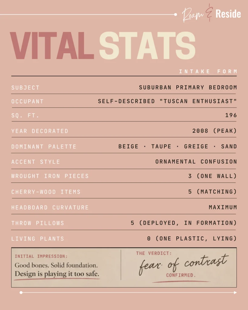
This bedroom isn’t suffering from bad taste. It’s suffering from chronic over-coordination.
The official diagnosis: Advanced Suburban Matching Disorder.
Symptoms include purchasing the entire bedroom set instead of multiple interesting pieces (that jive together), believing “neutral” means “all the exact same shade,” emotional support throw pillows, and an unwavering loyalty to wrought iron wall decor.
What Makes a Bedroom Look Outdated? The Design Crimes Explained
Contrary to popular belief, it’s not the beige. It’s not even the dark wood furniture.
And it’s definitely not because someone once owned a decorative wrought iron wall hanging. Let’s break this down step-by-step.
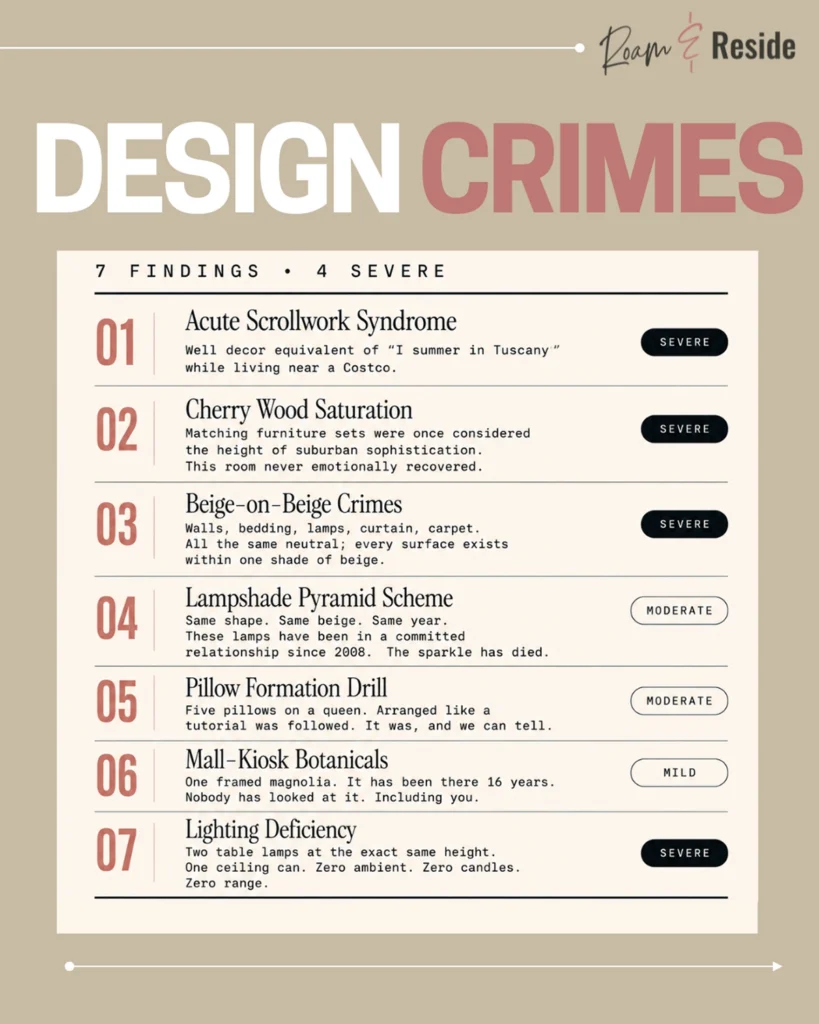
The Design Crime – Acute Scrollwork Syndrome:
Too Much Wrought Iron Wall Decor
One of the most common signs of an outdated bedroom is an oversized wrought iron wall medallion — usually flanked by matching scrollwork sconces; usually above the bed, usually purchased under the belief that larger equals more elegant.
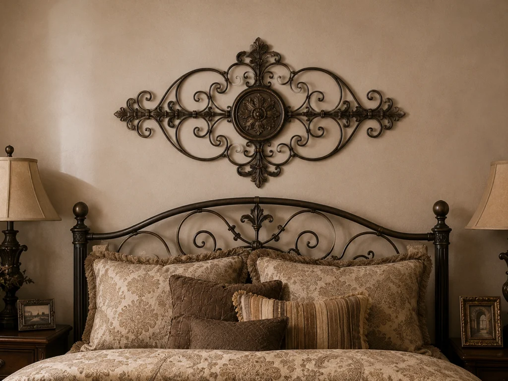
Wrought iron wall decor was the defining accessory of the early 2000s suburban bedroom. The scrollwork communicated one thing: I have been to Tuscany, or at least to HomeGoods.
It defined an era. And now we can’t unsee it.
The problem isn’t wrought iron itself. It’s its scale, context, and over-ornamentation. Oversized ornamental metalwork adds visual heaviness without warmth, softness, or texture. It dominates without contributing. And it became so culturally overexposed that our collective design nervous system now associates it with model homes, faux grape clusters, and cozy kitchen signs written in a Papyrus font.
The era ended. The medallion stayed.
The Design Crime – Cherry Wood Oversaturation:
The Matching Bedroom Furniture Set Problem
Ah yes. The complete bedroom suite. A cultural artifact from a simpler time — when furniture stores convinced an entire generation that personality was dangerous and every wood finish should arrive pre-approved by the manufacturer.

Buying a matching bedroom furniture set is one of the most common decorating mistakes that makes a bedroom look dated. One trip to the store, one decision, complete bedroom. The problem is that “complete” and “interesting” are not the same thing.
Matching sets flatten a room because they remove discovery. When every piece shares the same stain, the same shape language, the same weight, the same finish, and the same visual volume, the room has no hierarchy. Nothing leads. Nothing recedes. Nothing surprises.
Copy. Paste. Repeat.
Great rooms feel collected over time — like the furniture arrived from different places, different moments, different decisions. Furniture-store rooms feel purchased between 1:00 and 3:30 PM during a holiday weekend financing event.
The Design Crime – Fifty Shades of Beige:
Why Poorly Neutralized Bedrooms Feel Flat and Dated
Neutral rooms can be beautiful. This room, however, appears to have entered an exclusive long-term relationship with one singular undertone and refused to see any other colors.
Walls: beige. Bedding: beige. Curtains: beige. Carpet: beige. Lamps: beige. The duvet dust ruffle: a slightly different beige. Even the decorative accents feel contractually obligated to remain within the oatmeal spectrum.
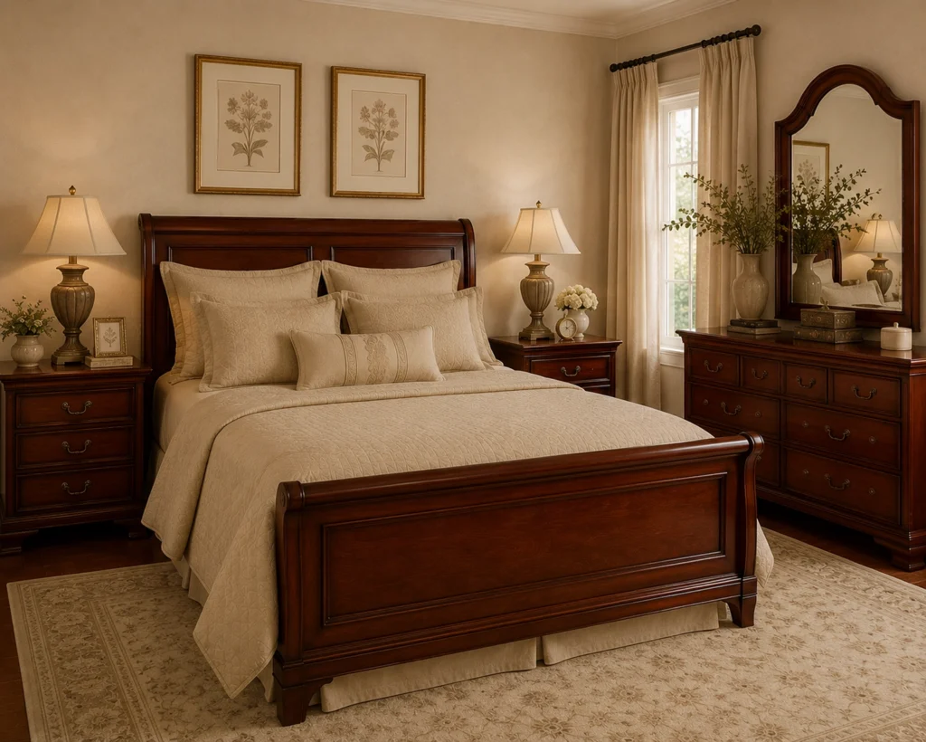
Without variation in tone, texture, or material, the entire room starts visually blending together like one continuous run-on sentence written in taupe.
The issue isn’t the color palette. It’s the lack of contrast. One shade of beige applied to every surface doesn’t read as sophisticated. It reads as a room that was afraid to make a decision.
The biggest misconception in neutral bedroom design is that calm comes from keeping everything the same tone. It doesn’t. Calm comes from balance, and balance requires contrast. Light needs dark. Warm needs cool. Matte needs sheen. Without those relationships, a space doesn’t feel peaceful. It feels flat and stale.
The Design Crime – Pillow Alignment Disorder:
How to Select and Style Throw Pillows to Create a Cozy Bed
These pillows are not styled. They are a tactical formation.
Every cushion appears to have received advanced training in posture, emotional restraint, and maintaining equal spacing at all times.
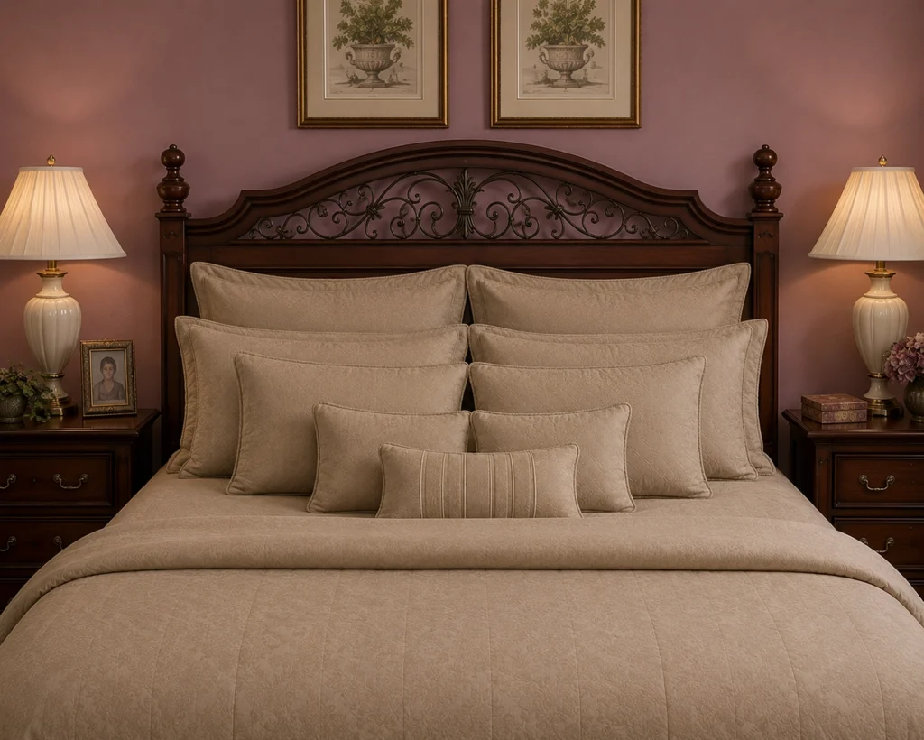
But great bedrooms need contrast: structured against relaxed, tailored against organic, polished against soft.
When every pillow matches perfectly and stands at full attention, the room starts feeling staged instead of inviting.
A well-styled bed should feel effortless. This one feels like it has performance anxiety.
The fix isn’t necessarily fewer pillows. It’s more variation:
- mixing textures instead of matching sets,
- introducing different scales and shapes,
- loosening the arrangement,
Because the most luxurious bedrooms don’t look overly decorated. They look deeply comfortable and make you want to snuggle.
Speaking of snuggles, I’ve got an entire blog post dedicated to the art of selecting and styling pillows you should check out here.
The Interior Design Intervention
Before we start panic-ordering new furniture or spiritually rebranding the entire bedroom, let’s establish something important: This room is not hopeless. It’s just heavily committed to a very specific era of suburban coordination. And honestly? There are worse things.
Because underneath the ornamental scrollwork and aggressively matching bedding, the room actually has several things working in its favor: a warm palette, balanced proportions, decent symmetry, and furniture that still feels substantial and grounded.
The issue isn’t the foundation. It’s the styling decisions layered on top of it over time.
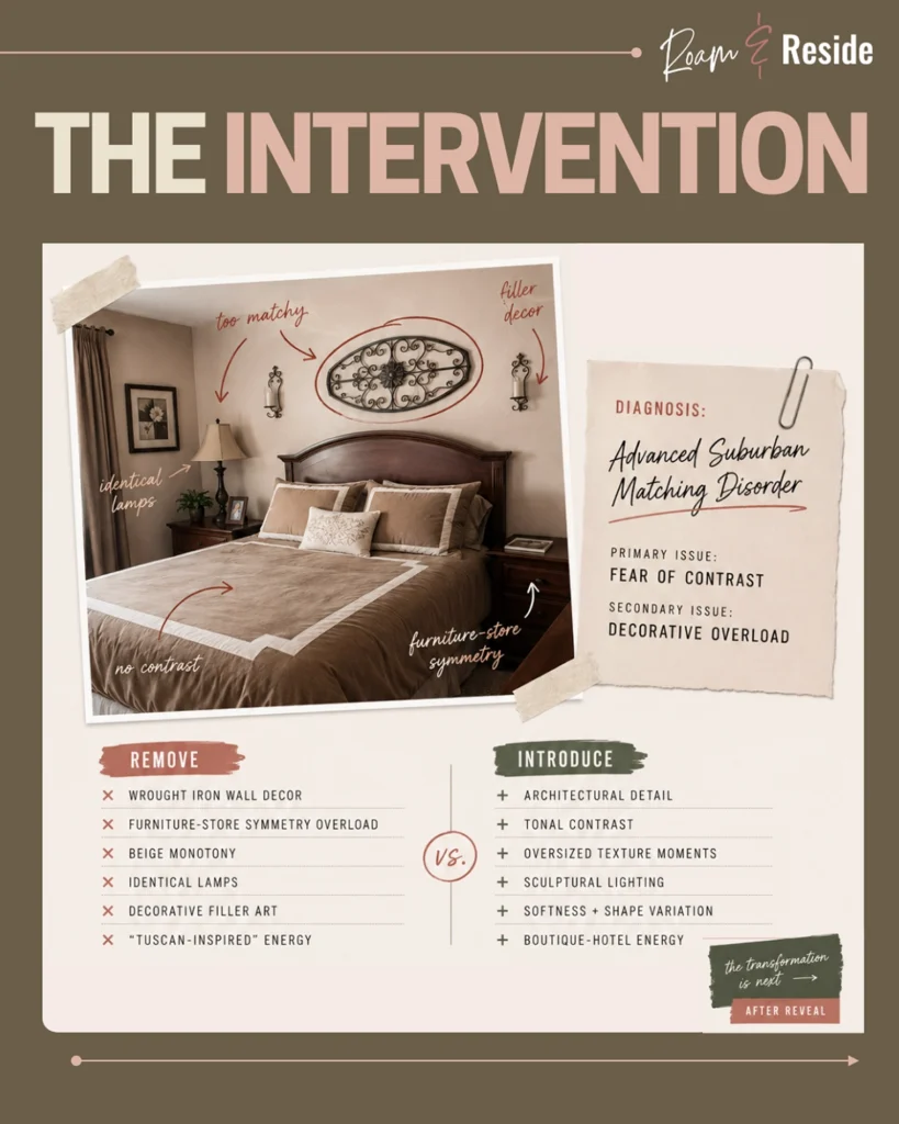
The Bedroom Reveal: Before and After
Most redesigns don’t require erasing everything. This one, however, required a fairly aggressive edit. Because sometimes the kindest thing you can do for a room is start the conversation over with better vocabulary. Ready to see the transformation?

Here’s what makes the transformation work:
The room didn’t suddenly become colorful. It didn’t abandon warmth. And it didn’t swap traditional style for cold minimalism.
The palette is still neutral. The wood tones are still rich. And the room still feels calm and approachable.
But now there’s contrast.
The warm tones stayed because they work. The proportions stayed because they were never the problem. What changed was everything that had been layered on top of them: the matched sets, the ornamental iron, the beige monotony, the identical lamps standing at attention since 2008.
In their place: architectural detail that earns its presence. Sculptural lighting that creates atmosphere instead of just visibility. Texture that makes you want to touch things. A headboard with an actual point of view. Neutrals that breathe instead of suffocate.
The room went from furniture showroom to boutique hotel bedroom. Not because everything was replaced, but because every replacement was intentional.
That’s the difference between decorating and designing.
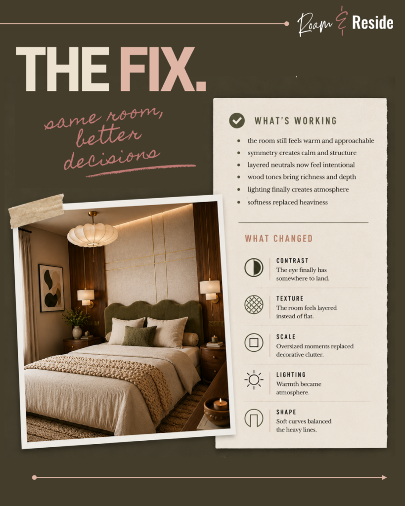
The Tuscan Bedroom Transformation Takeaways


At first glance, this transformation looks dramatic. And to be fair, we did replace literally everything.
But the biggest change wasn’t the furniture. It was the philosophy.
The original room was built around coordination. The redesign was built around contrast.
Love the After?
Yes, it’s a beautiful space after the makeover. But there are a lot of significant steps between the “before” and the “after.”
Many people will love and want the look. But few will understand the how and why it works. This makeover wasn’t just about replacing furniture and accessories.
Every paint color, texture, material, and styling choice was selected to create a warmer, softer, more elevated version of the room.
Download my free guide, where you’ll find the paint colors, texture palette, furniture swaps, and designer reasoning behind every major decision in the room.
In other words: The cheat codes.
Modern Tuscan Bedroom Ideas: How to Make Tuscan Style Feel Current
The secret is surprisingly simple: focus on the materials, not the motifs.
Many dated Tuscan interiors relied on decorative elements to communicate the style. Wrought iron scrolls, faux finishes, themed artwork, and matching furniture collections all worked overtime to announce, “This is a Tuscan room.”
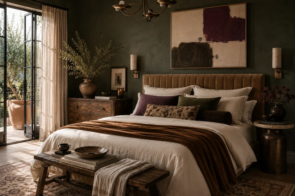
Modern Tuscan design takes the opposite approach. Instead of relying on decorative symbols, it creates atmosphere through natural materials, warm neutral colors, textured walls, aged woods, linen fabrics, stone surfaces, and thoughtful layering. The style feels quieter, but ultimately more convincing.
Are Tuscan Style Interiors Actually Making a Comeback?
Yes. But today’s interpretation feels very different. The problem was never Tuscan style itself. The problem was when Tuscan became a decorating theme instead of a design philosophy.
The style of the early 2000s got it wrong: heavy furniture, decorative overload, matching collections, and enough wrought iron to reinforce a suspension bridge.
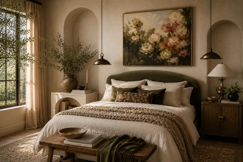
Modern Tuscan design keeps the warmth, natural materials, and relaxed elegance that made the style appealing in the first place. It trades themed décor for texture, dark woods for lighter finishes, and visual clutter for breathing room.
Think less Olive Garden. More boutique hotel in the Italian countryside.
The spirit remains. The accessories got edited.
FAQ’s: All You Need to Know to Fix a Dated Tuscan Bedroom
Why does my bedroom feel dated?
A bedroom often feels dated not because of a single piece of furniture, but because of a collection of design choices that were popular in a specific era. Matching furniture sets, identical lamps, heavy decorative accents, and a lack of contrast can make a room feel stuck in the past. Updating texture, lighting, scale, and material variety often has a bigger impact than replacing everything at once.
Are matching furniture sets out of style?
Let’s just say they aren’t doing you any favors. Matching furniture sets became popular because they made decorating easy. The downside is that they also make rooms feel predictable.
The most beautiful bedrooms usually look assembled rather than purchased. A little contrast creates a lot more character.

How do you make a bedroom look more modern without replacing everything?
Start by removing the things that are trying too hard. Things like oversized wall decor, furniture accessory sets, and decorative filler pieces that nobody would miss if they disappeared tomorrow.
Then focus on adding texture, updating lighting, and creating more contrast. Modern rooms feel edited,
not crowded.
Why does my bedroom look boring, and how do I fix it?
Probably because everything is speaking at the same volume. When every piece shares the same style, color, texture, and visual weight, the room starts feeling predictable—even when it’s technically well-decorated. The most memorable rooms rely on contrast, not coordination.
How can I make my bedroom look more like a boutique hotel?
As a hotel designer, I’ll let you in on the secret: hotel designers are obsessed with atmosphere and ambiance.
They think about lighting, scale, texture, mood. The experience of entering the room.
Most people decorate their bedrooms by asking: “What matches?” Hotel designers ask: “How do we want people to feel?” Two very different questions that lead to very different outcomes.
How do you make a traditional bedroom feel updated?
Focus on simplifying rather than completely changing the style. Replacing ornate accessories, introducing cleaner silhouettes, updating lighting, adding texture, and reducing visual clutter can modernize a traditional bedroom while preserving its warmth and character. And be sure to add depth to the color palette – you want a range of color tones.
The Real Design Crime?
If this makeover taught us anything, it’s that great rooms don’t happen because someone bought a prettier lamp.
They happen because someone made better decisions.
If today’s roast felt a smidge familiar…or uncovered a few uncomfortable truths about matching furniture, beige overload, or decorative choices made during the height of the Tuscan era, don’t worry. I can help.
My Interior Design Starter Kit is a simple, fun way to figure out what your space actually needs before you start spending money.
Inside, you’ll uncover:
• What you want your space to feel like
• What’s working (and what’s not!)
• What style actually fits your vibe
Because beautiful rooms don’t start with shopping. They start with clarity.
If you’ve ever found yourself staring at your room wondering where to begin, this is your first step.
Ready to Transform Your Space?
A great diagnosis is only the beginning. If this makeover sparked something, here’s where to go next.
Learn how to take your inspiration from mood board to reality without losing the plot halfway through the process.
→ From Interior Design Mood Board to Reality: How to Actually Execute Your Dream Space
Get the full designer roadmap for decorating your home with intention.
→ How to Decorate Your Home Like an Interior Designer
The big moves matter. But so do the details. Whether you’re working with a smaller room, a bare shelf, or a bed that needs a personality, these are the styling guides that pull everything together.
Steal the hotel industry’s best-kept bedroom secret with fabric-wrapped upholstered headboard panels that instantly elevate any room.
→ Fabric-Wrapped Upholstered Headboard Panels
The difference between a shelf that looks collected and one that looks cluttered comes down to a few very specific moves.
→ Interior Design Shelf Styling Tips
The easiest way to make a bedroom stylish and cozy.
→ Pillow Talk: Throw Pillow Styling Tips
Want to See Another Room Roast?
Then you’ll want to read the Frill of it All: A Cautionary Tale of Ruffles and Restraint. It’s the tragic tale when a floral fixation goes too far.
And if you’re curious to see how the Soft Girl Aesthetic can look with a grown-up glow-up, you’ll want to read this:
→ Room Roast: Bloom Service – An Intervention for an Overgrown Aesthetic
Want to Choose a Decorating Style for Your Home?
Check out this post to help you figure out what look is best for your home.
